Home > Dashboard > Exchange Dashboard
Download this articleExchange Dashboard
EnPower provides a default Mailbox activity and storage dashboard with the following tenant-level Exchange-related report charts as gadgets:
Active Mailboxes

The Active mailboxes chart shows the total count of user mailboxes in the selected tenants and the count of active mailboxes. On the chart, the X-axis depicts the date in the selected time range, and the Y-axis depicts the count of user mailboxes.
To highlight a specific line in the chart, hover your mouse over the Active or Total data category below the chart.
To hide a specific line in the chart, click the Active or Total data category, the corresponding line in the chart will be hidden. You can hover your mouse over the line to view the detailed active mailboxes count each day.
Storage

The Storage chart shows the amount of storage used in the selected tenants. On the chart, the X-axis depicts the date in the selected time range, and the Y-axis depicts the amount of storage being used by user mailboxes in the selected tenants. You can hover your mouse over the line to view the detailed storage used each day.
The storage report does not include storage used by archived mailboxes.
Storage Quota

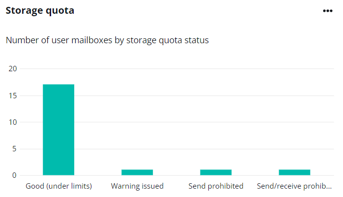
The Storage quota chart shows the number of user mailboxes in each quota category. There are four categories: Good (under limits), Send prohibited, Send/receive prohibited, and Warning issued. The X-axis on the chart is the quota category, and the Y-axis depicts the number of user mailboxes in each storage quota. You can hover your mouse over the bar to view the detailed number of user mailboxes for each storage quota.
Mailbox Action

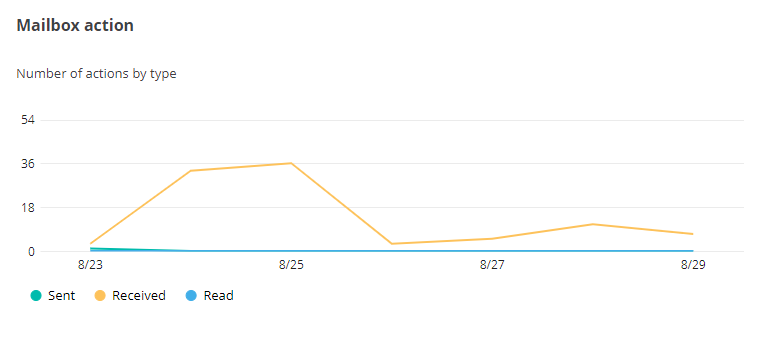
The Mailbox action chart shows the number of mailbox actions going on in your organization. The action types include Sent, Received, and Read. The X-axis depicts the date in the selected time range, and the Y-axis depicts the number of actions of the type email sent, email received, and email read.
To highlight a specific line in the chart, hover your mouse over the Sent, Received, or Read data category below the chart.
To hide a specific line in the chart, click the Sent, Received, or Read data category, and the corresponding line in the chart will be hidden. You can hover your mouse over the line to view the detailed number of actions each day.
Meeting Action Chart

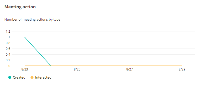
The Meeting action chart shows the number of meeting actions going in your organization. The action types include Created and Interacted. The X-axis depicts the date in the selected time range, and the Y-axis depicts the number of actions of the type of meeting created and the number of meetings interacted.
To highlight a specific line in the chart, hover your mouse over the Created or Interacted data category below the chart.
To hide a specific line in the chart, click the Created or Interacted data category, the corresponding line in the chart will be hidden. You can hover your mouse over the line to view the detailed number of actions each day.