Home > Dashboard > Users Dashboard
Download this articleUsers Dashboard
EnPower provides a default user activity and office activation dashboard with the following tenant-level User-related report charts as gadgets.
Active Users

The Active Users chart shows the number of active users on Microsoft 365 Services over the selected time range. The services included are:
-
Microsoft 365 apps
-
Exchange
-
OneDrive
-
SharePoint
-
Microsoft Teams
-
Viva Engage
The X-axis depicts the selected time range for the report, and the Y-axis depicts the number of active users.
To highlight a specific line in the chart, hover your mouse over the service types below the chart.
To hide a specific line in the chart, click the service type, and the corresponding line in the chart will be hidden. You can hover your mouse over the line to view the detailed count each day.
User Activity

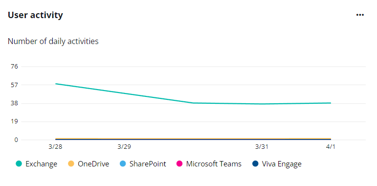
The User activity chart shows the number of daily activities on Microsoft 365 Services over the selected period. The services included are:
-
Exchange
-
OneDrive
-
SharePoint
-
Microsoft Teams
-
Viva Engage
The X-axis depicts the selected time range for the report, and the Y-axis depicts the number of daily activities.
To highlight a specific line in the chart, hover your mouse over the service types below the chart.
To hide a specific line in the chart, click the service type, and the corresponding line in the chart will be hidden. You can hover your mouse over the line to view the detailed count each day.
Due to API limitations, data in this chart cannot be retrieved for tenants in the GCC High environment.
Microsoft 365 Services

The Microsoft 365 Services chart shows the number of active and inactive users on each Microsoft 365 Services, including:
-
Microsoft 365 apps
-
Exchange
-
SharePoint
-
OneDrive
-
Viva Engage
-
Microsoft Teams
The X-axis depicts the Microsoft 365 Services, and the Y-axis depicts the number of users.
To highlight a specific part of bars in the chart, hover your mouse over the Active users or Inactive users data type below the chart. To hide a specific part of bars in the chart, click the Active users or Inactive users data type, and the corresponding part of bars in the chart will be hidden.
Hover your mouse over the bars to view the detailed numbers for Total, Active users, and Inactive users of each service.
Desktop Activation

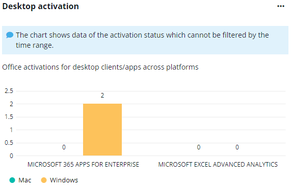
The Desktop Activation chart shows the activation of Office services for desktop clients and apps on Mac and Windows platforms, respectively. The X-axis depicts the Office services, and the Y-axis depicts the number of activated platforms for each service.
To highlight a specific part of bars in the chart, hover your mouse over the Mac or Windows below the chart. To hide a specific part of bars in the chart, click the Mac or Windows, and the corresponding part of bars in the chart will be hidden.
Hover your mouse over the bars to view the detailed numbers for Mac and Windows activations.
Mobile App Activation

The Mobile app activation chart shows the activation of Office services activations for mobile apps on Android, iOS, and Windows 10 Mobile platforms, respectively. The X-axis depicts the Office services, and the Y-axis depicts the number of activated platforms for each service.
To highlight a specific part of bars in the chart, hover your mouse over the Android, iOS, or Windows 10 Mobile below the chart. To hide a specific part of bars in the chart, click Android, iOS, or Windows 10 Mobile, and the corresponding part of bars in the chart will be hidden.
Hover your mouse over the bars to view the detailed numbers for Android, iOS, and Windows 10 Mobile activations.
User Activation

The Users Activation chart shows the number of activations for Assigned, and Activated product licenses, and Shared computer activations. The X-axis depicts the Office services, and the Y-axis depicts the number of users.
To highlight a specific part of bars in the chart, hover your mouse over the Assigned, and Activated product licenses, and Shared computer activations below the chart. To hide a specific part of bars in the chart, click the Assigned, and Activated product licenses, and Shared computer activations, and the corresponding part of bars in the chart will be hidden.
Hover your mouse over the bars to view the detailed numbers for Assigned, and Activated product licenses, and Shared computer activations.
App Users

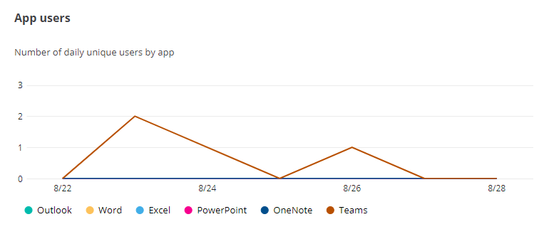
The App User chart shows the number of daily unique users on apps, including Outlook, Word, Excel. PowerPoint, OneNote, and Teams.
The X-axis depicts the selected time range for the chart, and the Y-axis depicts the number of daily unique users.
To highlight a specific line in the chart, hover your mouse over the apps below the chart.
To hide a specific line in the chart, click the app name, and the corresponding line in the chart will be hidden. You can hover your mouse over the line to view the detailed user number for the app each day.
Platform Users

The Platform User chart shows the number of daily unique users for Microsoft 365 Apps on different platforms, including Windows, Mac, Mobile, and Web.
The X-axis depicts the selected time range for the chart, and the Y-axis depicts the number of daily unique users.
To highlight a specific line in the chart, hover your mouse over the platforms below the chart.
To hide a specific line in the chart, click the platform, and the corresponding line in the chart will be hidden. You can hover your mouse over the line to view the detailed user number for the app each day.