Home > Power BI Report Guides > tyGraph for Teams
Download this articletyGraph for Teams
tyGraph for Teams is a comprehensive set of reports and analytics that help you better understand and better manage your teams and channels. This is a summary of all tooltips on the tyGraph for Teams report. All tooltip items are brief descriptions of the visual and calculation.
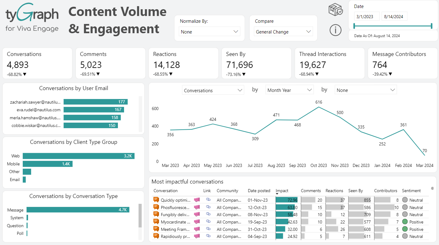
Universal Report Header
-
tyGraph Logo – The logo will redirect you to our website. You can find our signup process here for those looking to sign up and authorize our tool with your own data.
-
Date slider – Use this to select a rolling range of recent dates. You can erase this slicer to select specific dates (below) outside the rolling range. You can glance at the "Report Period" element at any time to see the overall filter.
-
Harvest date – This shows the most recent date in the dataset. If the date is behind what you expect, check if the dataset has been refreshed. If you are in tyGraph Online, please contact support or your Admin immediately.
-
Time period comparison slicer – Apply custom configurations to how you evaluate change in any measure over time. You will now see a drop down at the top of the report which allows you to evaluate changes.
-
General Change
-
Month Over Month
-
First vs Last Full Month
-
Period Over Period
-
Year Over Year
-
Recent Activity
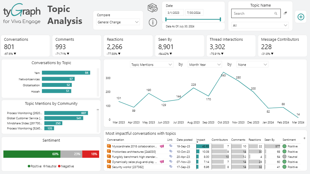
This page gives you an overview of how your teams and team members are performing from an engagement perspective. You will find visualizations on channel engagement, your teams' top influencers, the MAE score, and recent activity per team. You should always strive to beat your engagement from the previous period.
-
Engaged Teams Card – Total teams that have had at least one MAE Action for the period divided by all teams for the same period. Teams are counted once regardless of activity volume.
Time period comparisons are also displayed directly below the current value, i.e., Month over Month.
-
Engaged Members Card – Total users that had at least one MAE Action for the period divided by all users for the same period. Users are counted once regardless of activity volume.
Time period comparisons are also displayed directly below the current value, i.e., Month over Month.
-
Engaged Teams Gauge – The colored portion indicates all teams that had a MAE Action within the report period. The gauge baseline is the total teams that were created and had not been deleted before any date in the report period.
-
Engaged Members Gauge – The colored portions are users who took an MAE Action within the report period. The gauge baseline is total unique users with a Microsoft 365 license in the report period. You can refine this baseline by filtering licenses in the filter pane (right edge).
-
Top Influencers Matrix – This score rewards users who get responses, reactions on their messages, or hold broad connections across the company.
Influencer Score = (([ContributionPoints] + [ImpactPoints] + [BreadthPoints]) *[ReachPoints]) /100.
Contribution - Points for your actions. Starting a thread= 2 Pts, Message = 1 Pt, Reaction= .5 Pts.
Impact - Points for reactions you get. Replies from others, Reactions received, mentions of you = 1 Pt.
Breadth - Channels you're a member * 100
Reach - Total unique users you've interacted with.
-
Channel Engaged Members by time – These visual displays your engaged members by MAE score over time selected in the slicer.
-
MAE Score and Title – This bar chart will show which channels are most engaged. You can drill up/down to see the top teams/channels with MAE score.
MAE Score = The sum of actions you have selected in the MAE Score Metrics filter (right). This visual contains a dynamic team>channel axis which can be manipulated in the visual header. (shown below)
-
Click a team or channel above and then select this button to navigate to the Team/Channel Detail Page for that item.
-
Click a team or channel above and then select this button to navigate to the Sentiment Analysis Page for that item.
-
Click a team or channel above and then select this button to navigate to the Network Diagram Page for that item.
Organization Adoption
-
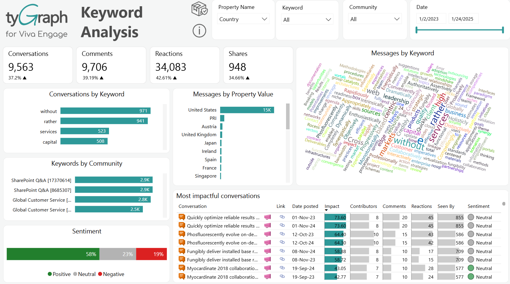
Voice Calls Trend Card – Displays the total summed difference in voice calls depending on what is selected in the time period comparison slicer located in the header.
-
Time Period Comparison – This is the percentage change in voice calls depending on what time period comparison is selected from the slicer in the header. i.e., Month over Month. Year over Year, etc.
-
Total Voice Calls Card – Displays the summed total of active users voice calls for the selected time period in the date slicer located in the header.
-
Meetings Trend Card – Displays the total summed difference in teams meetings depending on what is selected in the time period comparison slicer located in the header.
-
Time Period Comparison – This is the percentage change in Teams meetings depending on what time period comparison is selected from the slicer in the header. i.e., Month over Month. Year over Year, etc.
-
Total Meetings Card – Displays the summed total of meetings attended by all active users in Teams for the selected time period in the date slicer located in the header.
-
Messages Trend Card – Displays the total summed difference in Teams messages depending on what is selected in the time period comparison slicer located in the header.
-
Time Period Comparison – The percentage change in all messages in teams from the previous parallel period to the current period. This includes both Chat and Channel messages.
-
Total Messages Card – Displays the summed total of active user's messages for the selected time period in the date slicer located in the header.
-
Active Members Trend Card – The summed change in active users in Teams depending on what time period comparison is selected in the slicer located in the header. A user is active if they’ve participated in a meeting, voice call, or posted a chat or channel message. This is not the same as an engaged member.
-
Time Period Comparison – The percentage change in active users in Teams from the previous report period to the current one. A user is active if they’ve participated in a meeting, voice call, or posted a chat or channel message. This is not the same as an engaged member.
-
Total Active Members Card – The total unique users who have had Teams activity in the report period. A user is active if they’ve participated in a meeting, voice call, or posted a chat or channel message. This is not the same as an engaged member.
-
Dynamic Teams Visualization Area – This area displays visualizations depending on which button listed above is selected. The corresponding data will be visualized over time in a line chart. It contains a dynamic axis allowing you to drill into the aggregation using the up and double down arrows at the top. i.e., when the Meetings trend button is selected the visualization will display aggregations of teams & user's meetings over time.
-
Users With Chat Only No Meetings – Click this card, and you can see a detailed count of unique users who have been posting chat in the report period but have not participated in any meetings or posted in a channel. This is in a dynamic organization hierarchy so you can navigate up and down to different levels.
-
Users Meeting With No Channel Activity by User Property – Click this card, and you can see a count of unique users who have been participating in meetings but have not posted in any channel conversations. You can explore the data from different perspectives by selecting specific user properties, including country, job title, organization, department, user email, or region (built-in).
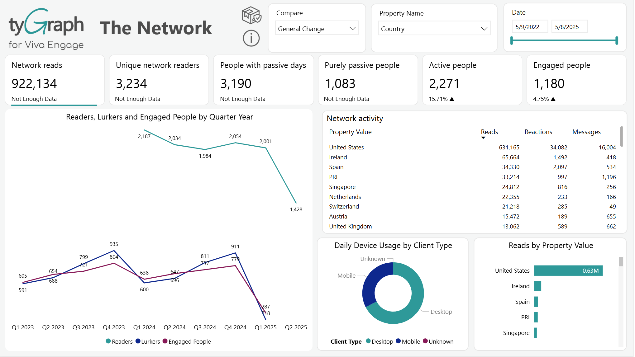
Team Activity
-
Channels Card – Total channels currently in existence on the tenant for the report period.
-
Tabs Card – Total tabs on the teams in your selection for the report period.
-
Messages Card – Total of all text posted in teams or channels for the report period. This includes both posts and responses in a channel. A message can be categorized by Type, Importance, subject, etc.
-
Avg Days to Respond – How responsive is your team or channel? The average time between each message in a thread including the initiating message. This can be aggregated at the Channel or Team level. Example: John posts on 1 Dec gets a reply on 2 Dec, and then a user comments again on 7 Dec, the Avg = (1+6)/2 = 3.5. The average is NOT the difference between the second comment and the original thread date which would incorrectly = (1+7)/2 = 4
-
Engaged Team Members Card – Team members who have taken any one of your defined MAE Actions in the report period divided by the total unique members of that team.
-
Teams and Channels by Activity (Engagement) – This visual contains the MAE Score, channel numbers, engaged member numbers, tab numbers, stats of SharePoint File Activity for the Team/Channel Hierarchy for the report period.
-
Sentiment – Average sentiment score out of zero to one for the report period.
This is a dynamic visualization area that changes depending on which of the above buttons are selected.
-
Team Members Card – Total team members for the report period. This button is the default selected, there is a corresponding visual displayed below depicting team members emails, owned teams, team membership, and team join date.
The percentage change in team members for the time period comparison that is selected in the slicer located in the header.
-
New Team Members Card – Total team members who joined a team or teams in the report period. If you click this button, it will change the below visual to display two visuals named 'Team Members Gained this Period' and 'Team Members Lost this Period' where you can see the list of users who were added for the report period.
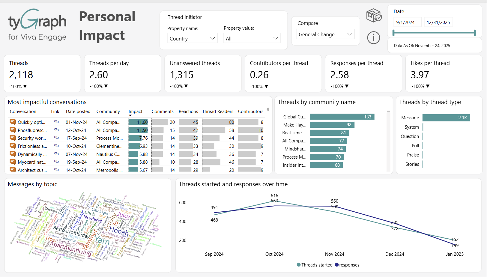
The percentage change in team members gained and team members lost for the time period comparison that is selected in the slicer located in the header.
-
Unengaged Members Card – Total users who were not engaged but are members of the team/teams. If you click this button, it will change the visual below to a visual named 'Unengaged Team Members' where you can find the details of unengaged team members (their email, job title, department, etc.).
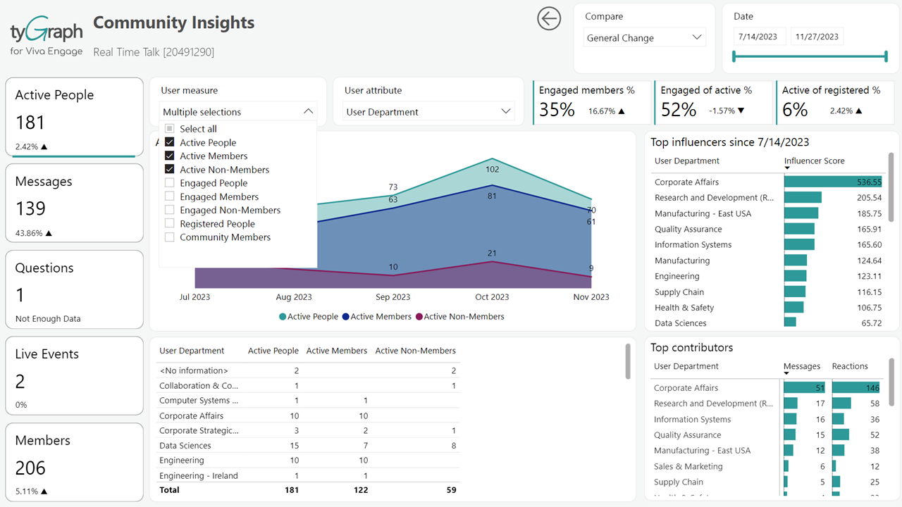
The percentage change in unengaged team members for the time period comparison that is selected in the slicer located in the header.
-
-
Most active people by user attributes – Users ranked by activities during the reporting period. Use the user property slicer to explore more granular levels.
-
Top Influencers – Who are my top influencers? Users are sorted by influencer score. Click on a specific user or multiple users to analyze their details in the visuals.
-
Activity Over Time – Shows the messages, reactions, and mentions volume over time for the report period. This visual contains a dynamic date axis which can be manipulated using the drilldown icons in the visual header.
File Collaboration
-
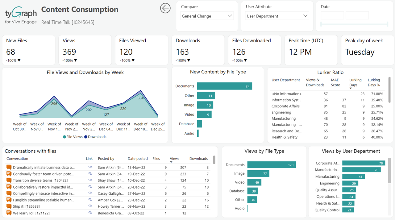
Activity Name – Select the file activity to report on. Most common activities are selected by default.
-
Activity with File Activity Over Time – This is a dynamic visualization area that changes depending on which file Activity name is selected from #1.
-
Top teams by: Activity with File Activity – Use the drill down options to manipulate the visual.
-
Top Activity by: User Property – Select a dimension from the user property slicer for the file activity rankings during the reporting period.
-
Top Files by: Activity with Activity – Top files matrix by summed total views that displays file name, file location, and total file views with a link to the file.
-
User Email list – A matrix that displays users e-mail, file accessed counts, and file deleted counts.
Channel MAE Score
-
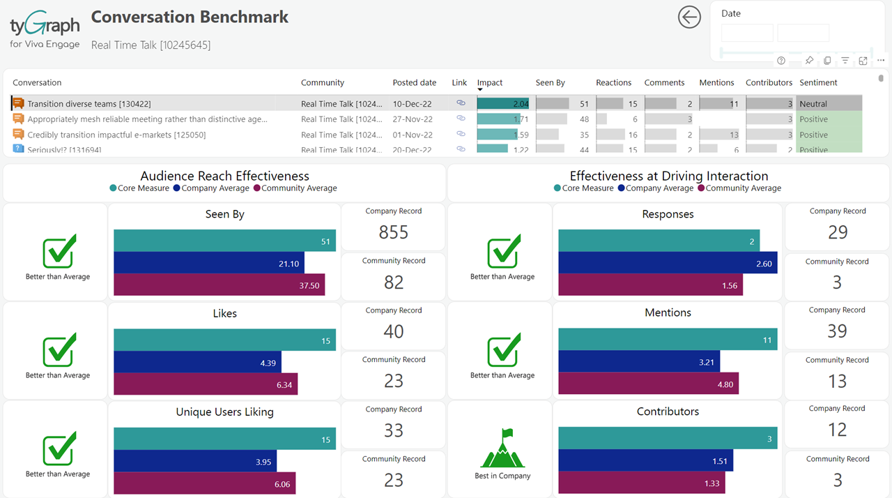
The MAE Score is central to how we measure Channel Engagement. A user, team, or channel is counted as “engaged” in other pages when they have any MAE Score activities (Mentions, Messages, Reactions) for the report period.
-
Engaged Members Card – In large text, total unique members with channel engagement in the report period. Small text below shows the percentage change for the time period comparison which is selected in the slicer located in the header
-
Unique Licensed Users Card – Large text displays the summed total of unique licensed users. Small below text displays the percentage change in unique licensed users depending on which time period comparison is selected from the slicer in the header.
-
MAE Score by Month Year – The total MAE Score for all teams for the report period selected in the date slicer in the header.
-
MAE Score by User Property – Matrix that displays MAE Score, engaged members, and unique licensed users. You can explore the matrix from different perspectives. For a detailed breakdown of the MAE Score, you can click the user property slicer and choose user email, country, job title, organization, department, and region (built-in)
-
Detail Table – Click here for a detailed breakdown of MAE Score by activity type.
-
Weekly Comparison – This button will display a visualization for a week over week comparison of MAE Score in the dynamic area below it. The five most recent weeks of MAE Score activity compared by day. You can control how many weeks are shown here in the “Visual Filters” by clicking on this chart and then opening the filter pane on the right.
-
Monthly Comparison – Looking to demonstrate the growth of channel usage? This button will display a visualization in the dynamic area below for a month over month comparison of MAE Score. Step back and compare your channel activity (MAE Score) from previous years. You will be able to analyze seasonality and set goals based on previous activity levels. You can also press the up arrow to see this by quarter.
-
Location Comparison – Click here to compare your top five cities by MAE Score. Top five cities by channel activity volume (MAE Score). You can expand/reduce the number of cities shown here in the visual filter (right ribbon). This also contains a dynamic axis so you can use the up and double down to change the aggregation.
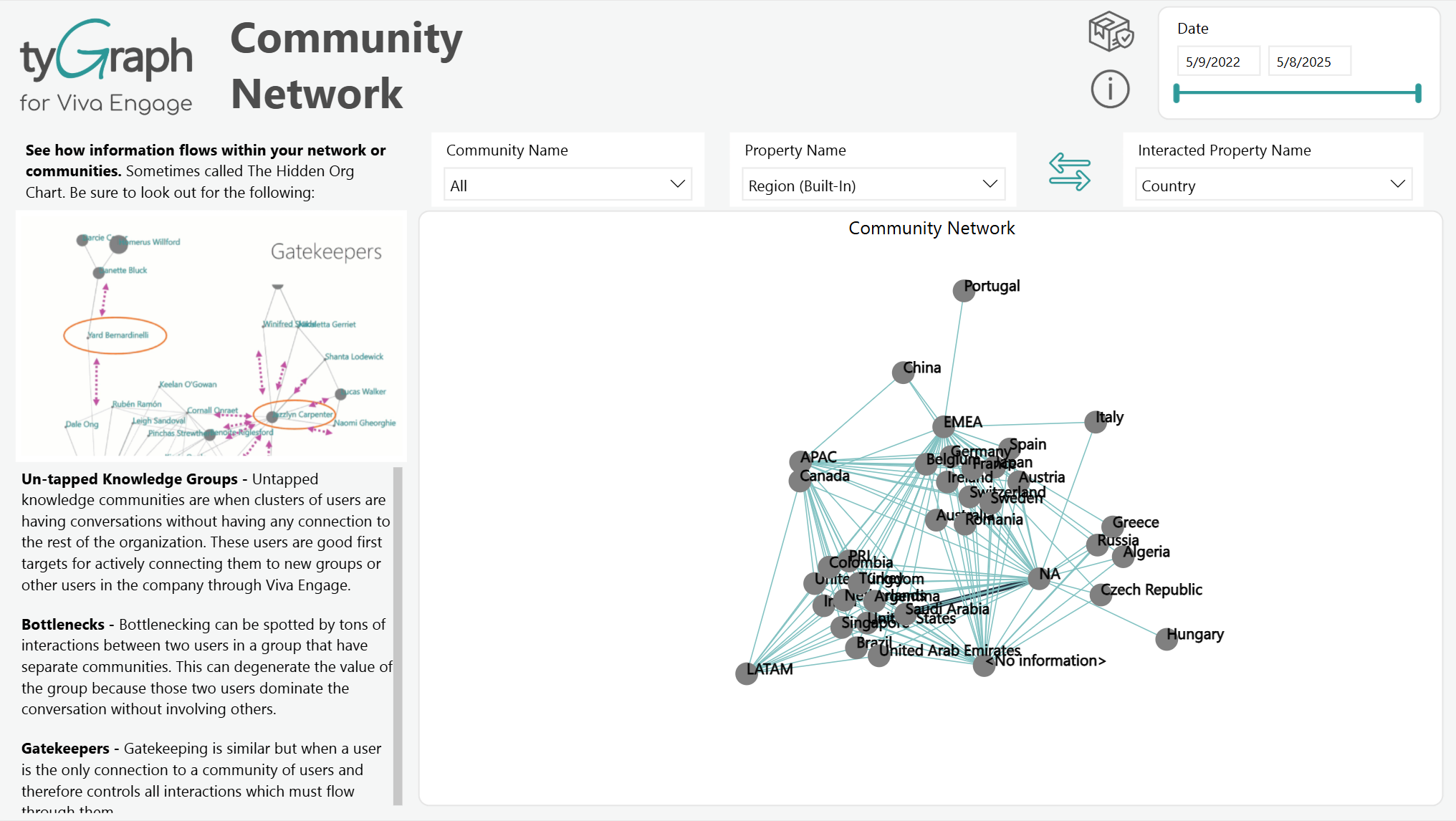
Network Interactions
-
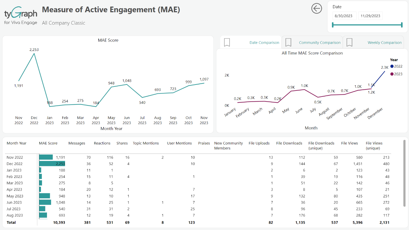
Team Name slicer – Select the teams that you want this report to focus on. To select multiple teams, hold down Ctrl and click each team name.
-
Property Name slicer – Select a property to filter the interactions based on that specific attribute.
-
Summary statistics – The MAE Score, number of messages, and engaged members on each team and channel. Feel free to click a team or channel in this chart to look at the communication flow within that team or channel.
-
Hidden Networks – See how information flows within your organization, teams, or channels. Sometimes called The Hidden Org Chart.
Teams and Channels
-
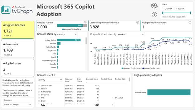
Team by Activity table – shows MAE Score, Channels, and Tabs (Tabs if SharePoint is licensed) for each team and channel for the report period. We also include the URL to take you straight into teams if you’d like to delete or manage certain channels. Each instance of this table can be drilled through to Analyze Team/Channel, Sentiment Tracking Details, Network Interactions Details and File Activity.
-
Team Members – Several total actions for each team member. This is a great chart to export. See the FAQ page on how to export data from visuals. You can also use the user property slicer on the column header to explore more granular reports.
-
Channels with No Activity This Period – A list of Teams and channels with no activity in the report period.
-
Team Owners – All Team Owners by Team and their email.
-
@Mentions – All mentions received/made by each user for the report period.
Discussion Sentiment
Sentiment is represented using categorical labels, "negative", "neutral", or "positive", indicating the overall tone of text, words, or sentences.
-
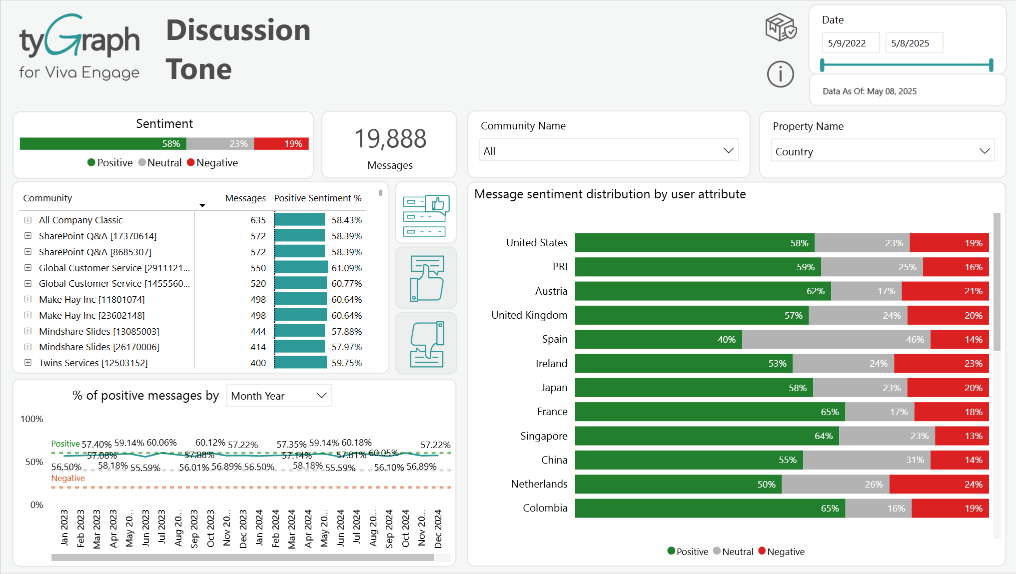
Sentiment Card – Displays the overall sentiment breakdown of messages as percentages categorized into Positive (green), Neutral (gray), and Negative (red) sentiment labels. This provides a high-level view of the tone across all discussions.
-
Messages Card – Shows the total number of messages analyzed within the selected date range. This gives context to the volume behind sentiment trends.
-
Team Name slicer – Select the team(s) that you want this report to focus on. To select multiple teams, hold down Ctrl and click each team's name.
-
User Property slicer – This slicer is dynamically populated with user attributes, which mirrors the data in your organization's Microsoft Entra ID. It enables granular filtering of the report visuals based on properties such as Country, Department, Region, or User Email. The available attributes may vary depending on your organization's directory configuration.
-
Team Sentiment - Lists individual teams along with their message counts and the percentage of those messages classified as positive. Assists in determining the levels of engagement across different teams.
-
Average Sentiment Scores and Messages by Date – Shows sentiment trends within the team or channel during the reporting period. Note the baselines for positive and negative scores. The visual includes a dynamic date hierarchy; use the double-down arrow to drill down and the up arrow to move up.
-
Message Sentiment Distribution by User Property – Breaks down sentiment distribution (Positive, Neutral, and Negative) across different values of a selected user property (e.g., Country). This enables analysis of how sentiment varies by demographic or organizational dimensions.
Pulse Activity
This report gives a comprehensive view of user activity within Microsoft Teams by analyzing communication methods, meeting participation, and collaboration metrics.
-
User Property – This slicer is dynamically populated with user attributes, which mirrors the data in your organization's Microsoft Entra ID. It enables granular filtering of the report visuals based on properties such as Country, Department, Region, or User Email. The available attributes may vary depending on your organization's directory configuration.
-
Time Period Comparison – A slicer that is used to select popular time period comparisons such as month over month, first vs last full month, year over year, and period over period which display the percentage change, along with a trend indicator arrow, in the fields below each card along the row.
-
Channel Messages – Total messages in team channels during the reporting period.
-
Private Messages – Number of one-on-one or group chat messages for the reporting period.
-
Meetings – Number of meetings organized during the reporting period.
-
Calls – Number of voice or video calls during the reporting period.
-
Working Out Loud % – Percentage of users actively collaborating.
-
Active Users – Number of users engaging with Teams.
-
Top Teams Users – Shows top users by the selected user property with channel message, private message, voice call, and meeting counts.
-
Teams Meeting Activity – Displays meetings organized and attended by the selected user property.
-
Working Out Loud Score – Highlights collaboration scores by the selected user property.
-
Teams User Activity Over Time – Trends in user activity across quarters/months/weeks/dates. You can drill down to the hierarchical levels.
-
Teams Screen Share Duration – Time spent for screen sharing, video, and audio duration by the selected user property.