Home > Power BI Report Guides > tyGraph for SharePoint Analytics
Download this articletyGraph for SharePoint Analytics
tyGraph for SharePoint Analytics is a comprehensive analytics solution designed to empower organizations with actionable insights into their SharePoint environment.
This guide provides an in-depth exploration of tyGraph’s capabilities, enabling administrators, content managers, and analysts to track user engagement, measure content performance, and optimize platform health. Whether monitoring site activities, analyzing user behavior, or refining content strategies, tyGraph for SharePoint Analytics equips users with the metrics and visualizations needed to maximize SharePoint’s impact and helps organizations enhance collaboration, improve content relevance, and drive informed decision-making.
Content Overview
-
Viewed Sites – The total unique engaged sites with views during the reporting period.
-
Viewed Sites (% Change) – Percentage change in viewed sites compared to the prior period. The previous period is the range of dates behind the current period for the same number of days.
-
Viewership Churn – Percentage of users who stopped viewing content during this period. This is calculated from the number of users that did not view in this period but did in the prior period divided by the total previous and current viewers [users from prior period not viewing now/(total prior + current users)].
-
Unique Page Viewers – Total unique page viewers. You can click on the neighboring data bars to see this based on a specific context like page viewers for a top site or page.
-
% Change in Viewers – The percentage change in unique viewers from the previous period to the current one. The previous period is the range of dates behind the current period for the same number of days.
-
Page Views – This is the total number of page views for the report period. This will count each time someone loads a page. If you love a page and keep going back to it, then this is your kind of measure!
-
Audience Peak Time – The time with the peak number of unique page viewers. You can click here to see a detailed plot below. The time zone is always UTC for this model.
-
Peek Day of Week – The day with the peak number of unique page viewers.
-
Top Sites By Unique Viewers – Sites ranked by the total unique viewers in the report period. Use See All Sites to expand the list.
-
See All Sites – Toggle to see all sites in Top Sites By Users.
-
See This Site – To drill through to Site Detail, select a single data point from Site Title & URL, Site URL, SiteCollectionSPWebUID, or SPWebUID
-
Top Pages by Unique Viewers – Top pages ranked by the unique page viewers. If someone views the same page multiple times in the same period they are only counted once.
-
See All Pages – Toggle to see all pages to see all Top Pages by Unique Viewers.
-
See This Page – To drill through to Page Audience, select a single data point from Object Name and ID or SPWebUID.
-
Pages Created – Shows the total number of pages created in the reporting period.
-
Avg. Views Per User – The average number of views per unique viewer.
-
% Unique Viewers – Percentage of total unique users with views in the reporting period.
-
Unique Page Viewers by Date – The number of unique page viewers over time. This visual contains a dynamic date hierarchy allowing you to change the bottom axis to fit your situation. Use the double down arrow to drill down and the up arrow to drill up.
-
Unique Viewers by Total Views – Distribution of views based on total page view.
Content Navigator
-
Site & Page Search – Use the search box to filter/report for specific sites or pages.
-
Content Navigator – Summary statistics by Hub Site/Site/Page. You can navigate this hierarchy using the plus symbols on the left.
-
View summaries – Summary statistics for recent viewers and views.
-
Text Content Search box – There are many elements that a user can click on in SharePoint. If you’re interested in a certain element you can search for it here and see it reflected in the clicks total below.
-
Recent Activity (date range) – Total clicks and the number of unique users clicking by element name. If the element did not have a label, we use the element class or the surrounding name.
-
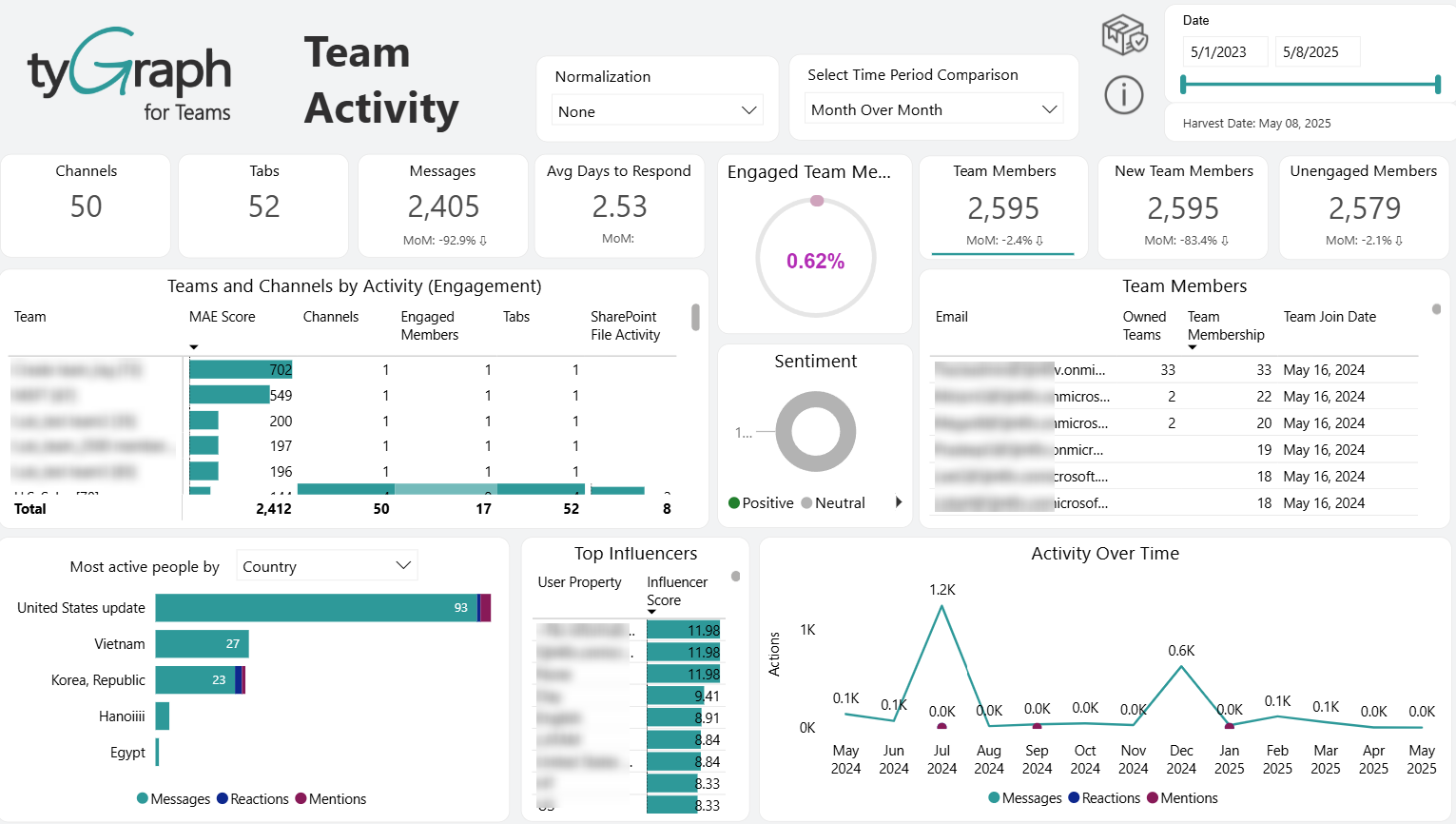
The Recent Activity displays data based on the Detail Period (days) parameter. This example shows that the summary period is set to May 1, 2024 – May 9, 2025, and the Recent Activity visual only shows data for March 1, 2025 – May 9, 2025.
-
Summary percentage – Summary that is based on statistics in the table above. You can select various levels above to see these percentages in the context of your selection. It will show 100% if the report aggregates all users/pages/news articles.
Content Health
-
Site & Page Search – Use the search box to filter/report for specific sites or pages.
-
Recent Activity – Total viewed pages and unique page viewers over time. This visual contains a dynamic date hierarchy allowing you to change the bottom axis to fit your situation. Use the double down arrow to drill down and the up arrow to drill up.
NOTEThe Recent Activity displays data based on the Detail Period (days) parameter. This example shows that the summary period is set to 5/1/2023 - 5/7/2025, and the Recent Activity visual only shows data for 5/1/2024 - 5/7/2025.
-
Last Activity – Filter pages that have had last activity within the range of dates. For example, select pages where the last view was 90-180 days ago. You can either delete these pages or remove references to them on your site menus.
-
Recent Slow Pages – Sometimes people stop using pages because they are slow, not because the content is poor. This totals the number of pages that load in over five seconds. You can sort by the Avg. Page Load column in the bottom right chart to see which are the slowest.
-
Avg. Page Load Duration – The average time for pages to load in your selection.
-
Viewed Root Sites – The total number of root sites with views in the report period.
-
Page and File Activity by Site – Pages and Files ranked by the total number of views they have accumulated.
-
Unique Viewers – The total number of unique viewers.
-
Viewed Pages – The total number of viewed pages in your selection.
-
% of Viewed Pages – The percentage of viewed pages within your selection.
-
Site Engagement by Content – Site-level engagement metrics including last activity week, unique viewers, and page views, helping identify the most accessed SharePoint sites.
-
Page Engagement by Content – Page-level metrics such as author, last activity date, average page load duration, and total views to identify both high-traffic pages and those with potential performance concerns.
Engagement Overview
-
Hub/Site Search – Use the search box to filter/report for specific sites or hub sites.
-
Comparison – The time intelligence trend comparison calculations dropdown selector.
-
Measure – Allows you to select different metrics to analyze, such as Viewers, Viewers gained, Viewers lost, First time viewers, Page viewers, Avg. time on page, Avg. session duration, and Sessions.
-
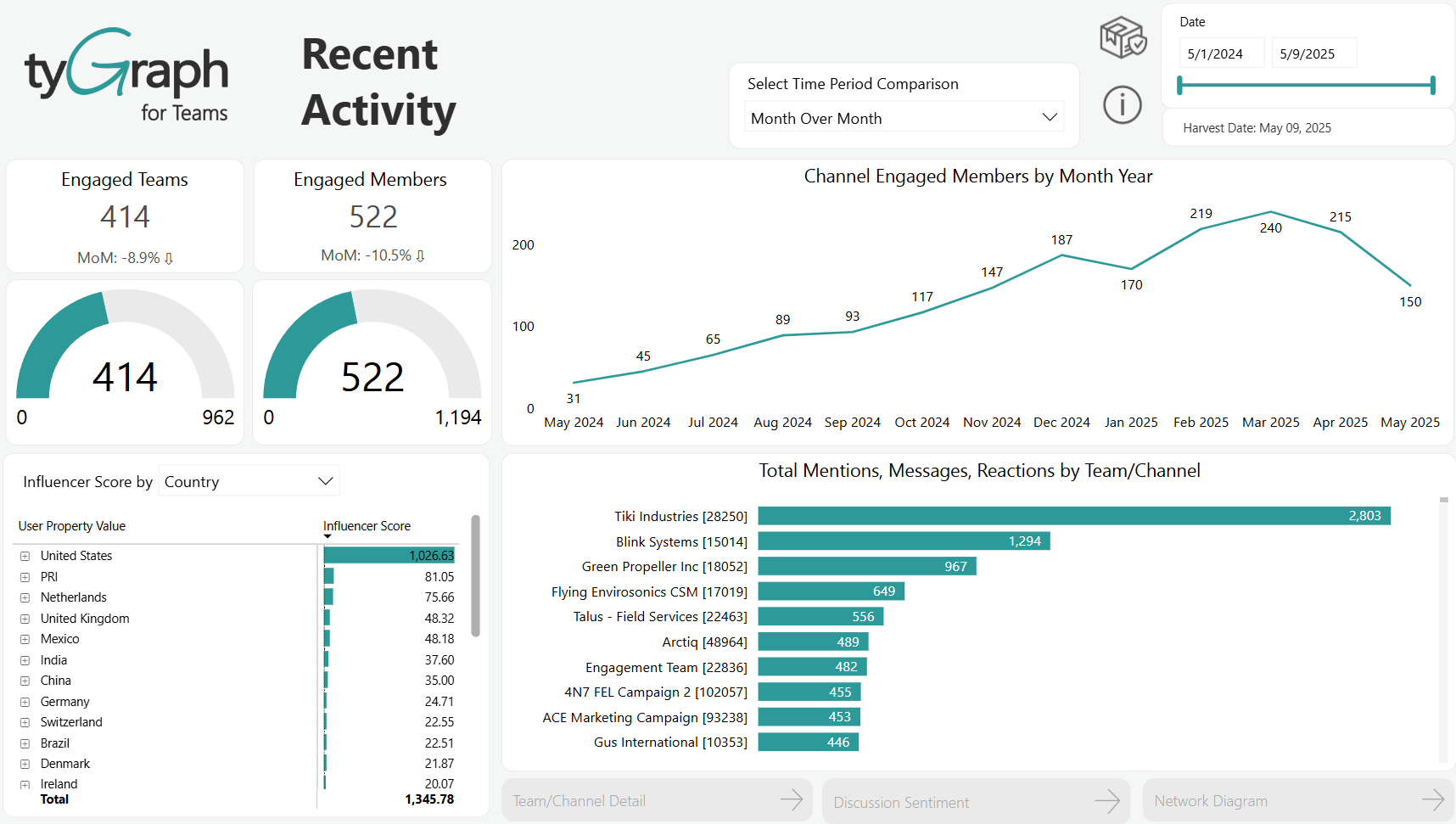
Active Users – Total Unique Viewers in the reporting period. The item at the bottom of the box is the percentage change in unique viewers from the previous period to the current one.
-
Bounce Rate – The percentage of page views where the user leaves immediately. The item at the bottom of the box is the percentage change in bounce rate from the previous period to the current one.
-
Session Duration – The average session duration in the reporting period. A session is the end-to-end time someone spends browsing on the platform regardless of the site or page. The item at the bottom of the box is the percentage change from the previous period to the current one.
-
Time On Page – The average time on page in the reporting period. The item at the bottom of the box is the percentage change from the previous period to the current one.
-
DAU/MAU – The ratio of users on the platform on a monthly level vs. a daily level. The bigger the gap, the less frequent users are on your platform. Click the buttons below for detailed articles on using this measure. For more details on the DAU/MAU ratio, refer to the Analytics and Reporting FAQ.
-
Active Users by Date – A plot of unique viewers in the reporting period. This visual contains a dynamic date hierarchy allowing you to change the bottom axis to fit your situation. Use the double down arrow to move down and the up arrow to move up.
-
Bounce Rate – A plot of bounce rate in the reporting period. This visual contains a dynamic date hierarchy allowing you to change the bottom axis to fit your situation. Use the double down arrow to move down and the up arrow to move up.
-
Avg. Session Duration – A plot of session duration for the reporting period. This visual contains a dynamic date hierarchy allowing you to change the bottom axis to fit your situation. Use the double down arrow to move down and the up arrow to move up.
-
Avg. Time On Page – A plot of average time on page in the reporting period. This visual contains a dynamic date hierarchy allowing you to change the bottom axis to fit your situation. Use the double down arrow to move down and the up arrow to move up.

-
MAU, WAU, DAU, and Unique Page Viewers – A plot of Monthly, Weekly, and Daily Active users over time. (MAU, WAU, and DAU Respectively). The dotted line is the ratio between the MAU line and your DAU line.
-
Viewers by Country – A total of unique users by location. Select a location dot to focus the above visuals on a certain location.
-
Viewers gained by Country – Identifies the locations where you have gained new viewers.
-
Viewers lost by Country – Identifies the locations where you have lost viewers.
-
First time viewers by Country – Shows the number of viewers accessing your site for the first time from each location.
-
Page views by Country – Displays the total number of page views from each location.
-
Avg. time on page by Country – Shows the average time spent on pages by users from each location.
-
Avg. session duration by Country – Shows the average session duration for users from each location.
-
Sessions by Country – Shows the total number of sessions by users from each location.
File Activity Overview
-
Hub & Site Search – Use the search box to filter/report for specific sites or hub sites.
-
Comparison – The time intelligence trend comparison calculations dropdown selector.
-
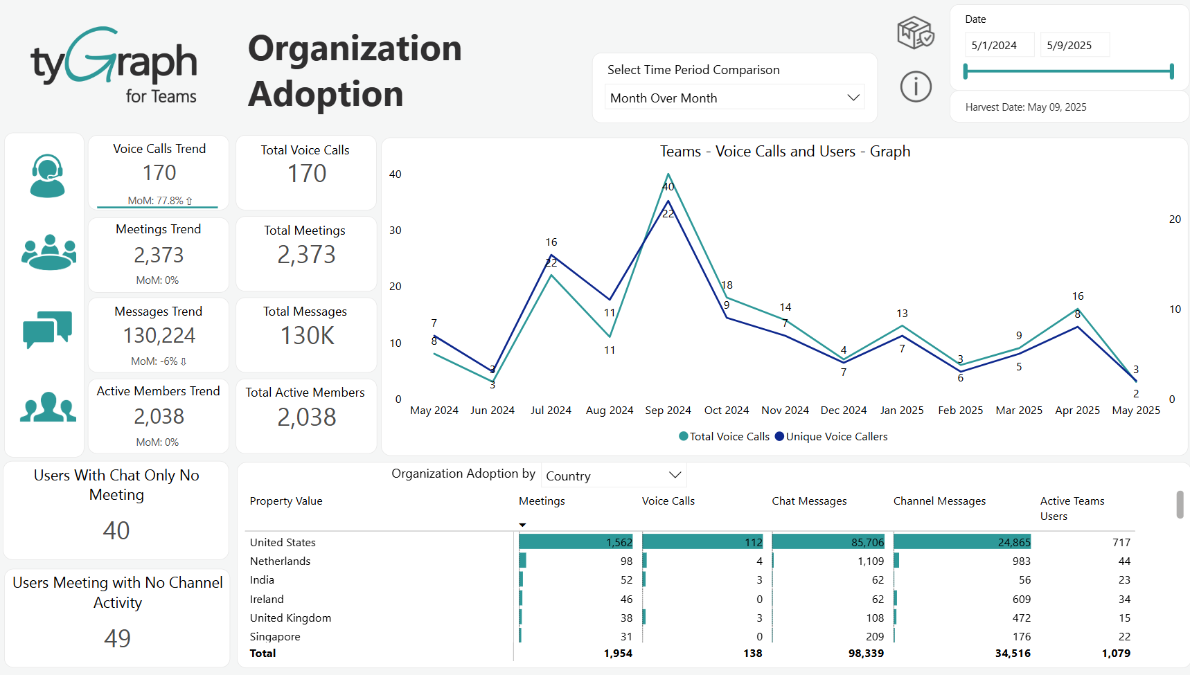
Unique File Users – Total number of unique users with any file activity during the reporting period.
-
File Downloaders – Total number of unique users who downloaded files during the reporting period.
-
File Type Activity – File types ranked by user interaction.
-
Unique File Users by Month/Year – Trends for file engagement. It allows you to visualize how unique users in file activities change from month to month.
-
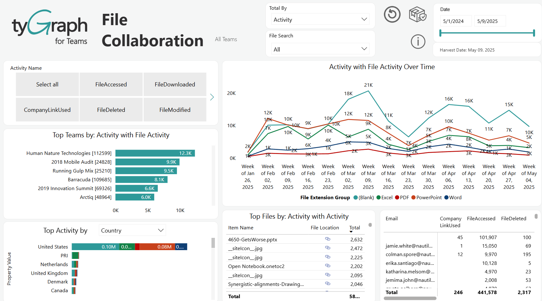
File Activity table – Displays how the users interact with the files in each site.
-
File Activity by User Property – Geographic analysis of file access. It lists the locations from which users accessed files and shows the number of unique users accessing, downloading, and modifying files from each country.
Page Explorer
-
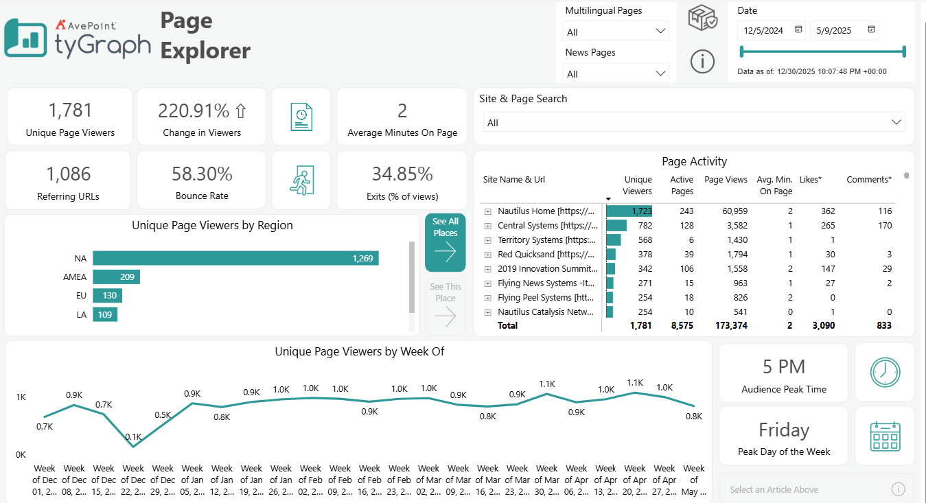
Multilingual Pages – Select whether to track engagement with multilingual content. Choose Yes to show only multilingual pages, No to exclude multilingual pages, or All to include both multilingual and single-language pages in results.
-
News Pages – Monitors how users interact with news articles separately from other types of pages.
-
Site & Page Search – Use this search box to filter/report for specific sites or pages. It allows you to quickly focus on particular areas of your platform for detailed analysis.
-
Page Activity – Provides insights into how users engage with your content. It helps identify which page are most active and what types of content drive engagement.
-
Unique Page Viewers – Total number of distinct users who viewed your pages.
-
Change in Viewers – Shows the percentage increase or decrease in viewers compared to a previous period.
-
Average Minutes on Page – Average time users spent on pages.
-
Referring URLs – Number of URLs that directed traffic to your pages.
-
Bounce Rate – Percentage of users who left without interacting further.
-
Exit (% of views) – Shows where users are exiting your platform. It helps identify pages that may not effectively prompt further engagement or conversion.
-
Unique Page Viewers by Location– Shows the geographical distribution of your audience. This visual contains a dynamic location hierarchy allowing you to change the bottom axis to fit your situation. Use the double down arrow to move down and the up arrow to move up.
-
Unique Page Viewers by Date– Tracks the number of unique users over time. This visual contains a dynamic date hierarchy allowing you to change the bottom axis to fit your situation. Use the double down arrow to move down and the up arrow to move up.
-
Audience Peak Time – Indicates the time of day when your audience is most active.
-
Peak Day of the Week – Shows the peak day of the week for page views. It can help optimize posting schedules and resources allocation around peak days.
Search Activity
-
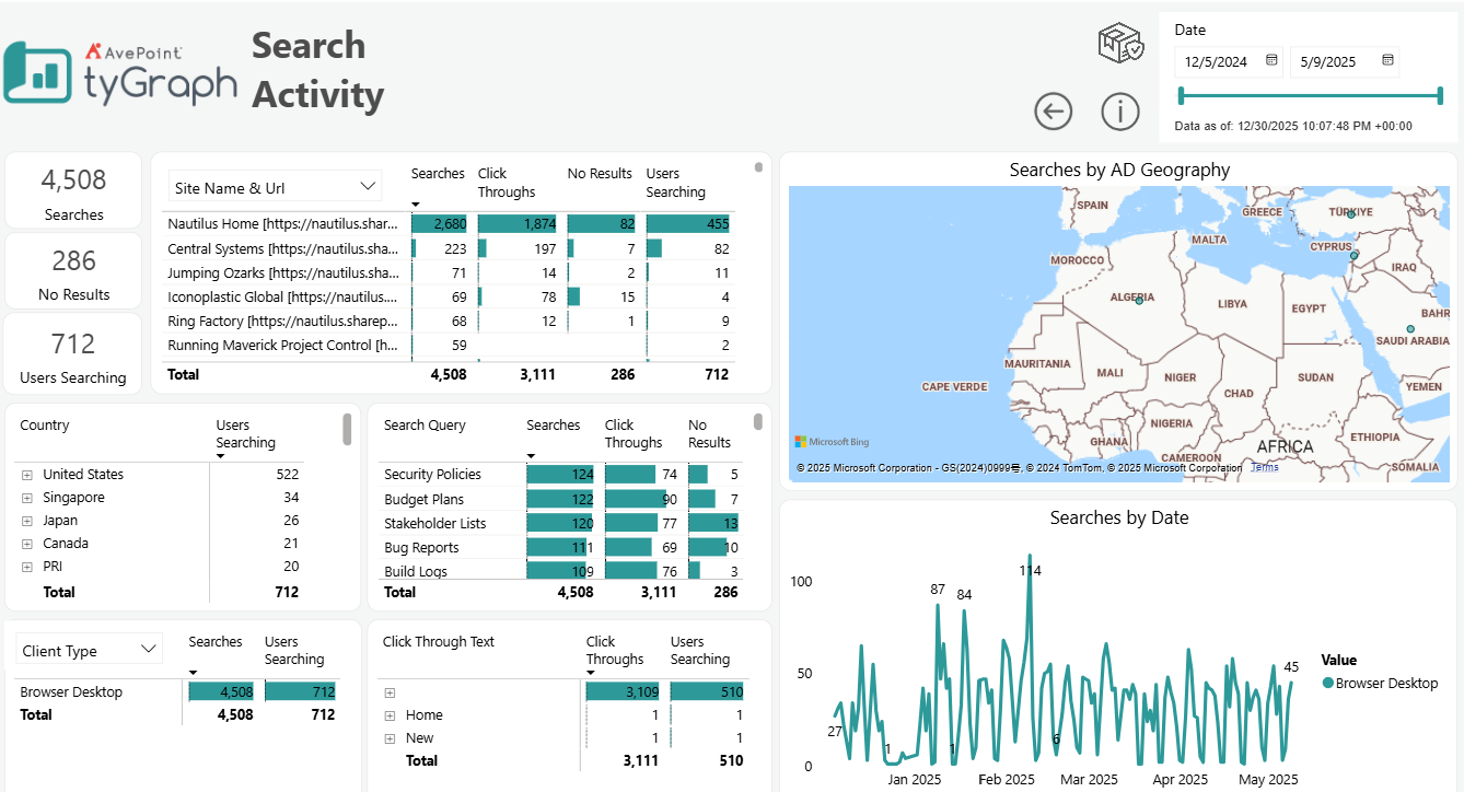
Searches – This count shows the total number of searches on a particular page for the reporting period.
-
No Results searches – This count shows the total number of 'No Results' found for any searches on a particular page for the reporting period.
-
Users Searching – This count shows the total number of users who performed searches on a particular page for the reporting period.
-
Site Name & URL – This table shows the stats of total searches, click-throughs, no results found for any search, and the number of users performing searches on particular sites for the reporting period.
-
Searches by AD Geography – This map shows the search stats (number of searches and number of users who are doing the searches) by geographical location for the reporting period.
-
Country – This table shows the number of users who searched based on location for the reporting period. You can drill down to see the numbers for different search queries.
-
Search Query – This table shows the number of total searches, click-throughs, and no results found for particular search queries for the report period.
-
Client Type/Operating System/User Browser – This table shows the total number of searches and the number of users searching based on Client types, Operating Systems, and Browser types for the report period.
-
Click Through Text – This table shows the total number of click-throughs and the number of users searching based on User name, clicked link, and click-through text hierarchy level for the report period.
-
Searches by Date – This line chart shows the search stats by dates. It can be drilled down/up to see the stats for different date hierarchy levels (i.e. yearly, quarterly, monthly, weekly, daily, period of the day, hourly, etc.) for the reporting period
Metadata Engagement
-
Verified Unique Readers – This card shows the total number of verified unique readers who have had a minimum read time (minutes) and scroll distance down the page for the reporting period.
-
Tags – This card shows the total number of tags/unique topics for the reporting period.
-
Bounce Rate – This card shows the bounce rate for the reporting period. Bounce rate means the percentage of views where the person viewed and immediately backed out. The lower the percentage is, the better. Below 10% is excellent, around 20% is good, and above 40% is generally bad.
-
Exits – This card shows the exit rate of viewers for the reporting period. An exit is the last page view in a user's session. Exits are important to measure because they indicate that users stopped their session with your content. This could be good or bad, depending on the view duration and purpose of the page.
-
Viewer Churn – This card shows the viewer churn for the reporting period.
-
Scroll % – The card shows the scroll percentage of the pages for the reporting period.
-
Average Minutes on Page – This shows the total amount of average time spent (in minutes) on a page for the reporting period.
-
Active Pages by Tag – This bar chart shows the count of active pages by tags for the reporting period.
-
Unique Page Viewers by Page – This bar chart shows the number of unique page viewers of the active pages by tags for the reporting period.
-
Average Minutes on Page by Page – This bar chart shows the total average minutes spent on the active pages by tags for the reporting period.
-
Pageviews by Scroll Percent – This line chart shows the counts of verified unique readers, tags/unique topics, bounce rate, exits percentage of views, unique page viewer churn, and scroll percentages by different date hierarchy levels: (daily, weekly, monthly, quarterly, and yearly) for the reporting period. We can drill up/down to see the stats from different time levels.
-
Hub Site Name & Url – Provides a detailed breakdown of user engagement metrics across different hub site, including number of verified users who accessed the site, number of distinct visitors to the site, number of likes, average time spent per page, percentage of users who left without further interaction, percentage of the page viewed, percentage of users exiting the site from this page, and proportion of verified readers against the total.
Campaign Analysis
-
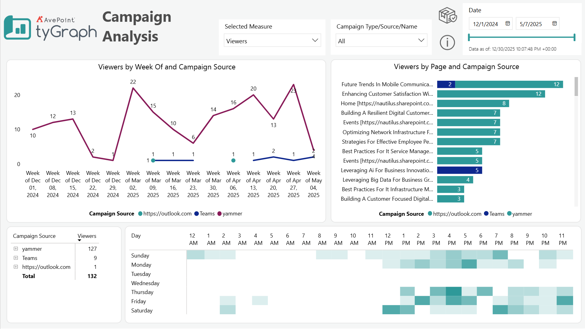
Selected Measure – Select the measure that you want this report to focus on.
-
Campaign Types/Source/Name – Filter to select specific campaigns for detailed analysis.
-
Viewers by Week of and Campaign Source – The scatter plot showing viewer engagement over different weeks and campaign sources, helps identify trends in viewer engagement over time and differences between campaign sources.
-
Viewers by Page and Campaign Source – A bar chart showing how viewers are distributed across different pages from various campaign sources, indicates which pages and campaign sources are most effective at driving traffic.
-
Campaign Source and Viewers table – Lists the number of viewers for each campaign source.
-
Audience Peak Time and Peak Day of the Week – Displays the days with engagement and the time of day of activity.
Intranet Benchmark
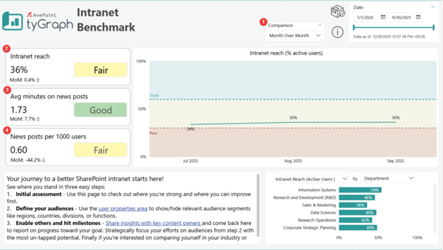
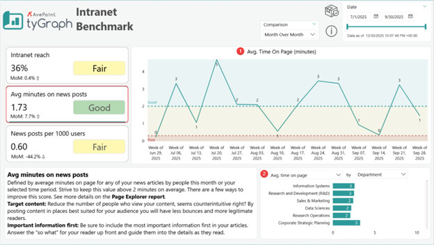
Intranet Benchmark – Default view
-
Time comparison slicer – Use the slicer to switch between different comparison calculations.
-
Intranet Reach card – Displays the percentage of active users versus registered users, plus the percentage change from the previous period (based on the chosen comparison method). The indicator (Good, Fair, or Poor) reflects intranet performance:
-
Good – At least 60% of registered users are active.
-
Fair – Between 30 and 60% of registered users are active.
-
Poor – Less than 30% of registered users are active.
-
-
Average minutes on news posts card – Displays the average time users spend reading news posts, along with the percentage change from the prior period. The performance indicator is categorized as:
-
Good – Users spend at least 1 minute on average.
-
Fair – Users spend between 0.3 and 1 minute on average.
-
Poor – Users spend less than 0.3 minutes on average.
-
-
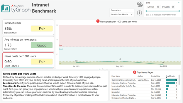
News posts per 1000 users card– Displays the number of published news posts per 1,000 engaged users, plus the percentage change from the previous period. The indicator evaluates posting volume:
-
Good – Between one and three posts per one thousand users.
-
Fair – Fewer than one post per one thousand users.
-
Poor – Three or more posts per one thousand users.
-
Intranet reach detail
Select the Intranet reach card to view detailed visuals.
-
Intranet reach (% active users) over time – Displays how the percentage of active users has changed over time. Use the drill down buttons to view the change over different periods of time (year, quarter, month, week of, and date)
-
Intranet Reach by User Property – Displays the percentage of active users broken down by user property value. Use the property name slicer to switch between different user properties.
Average minutes on news posts detail
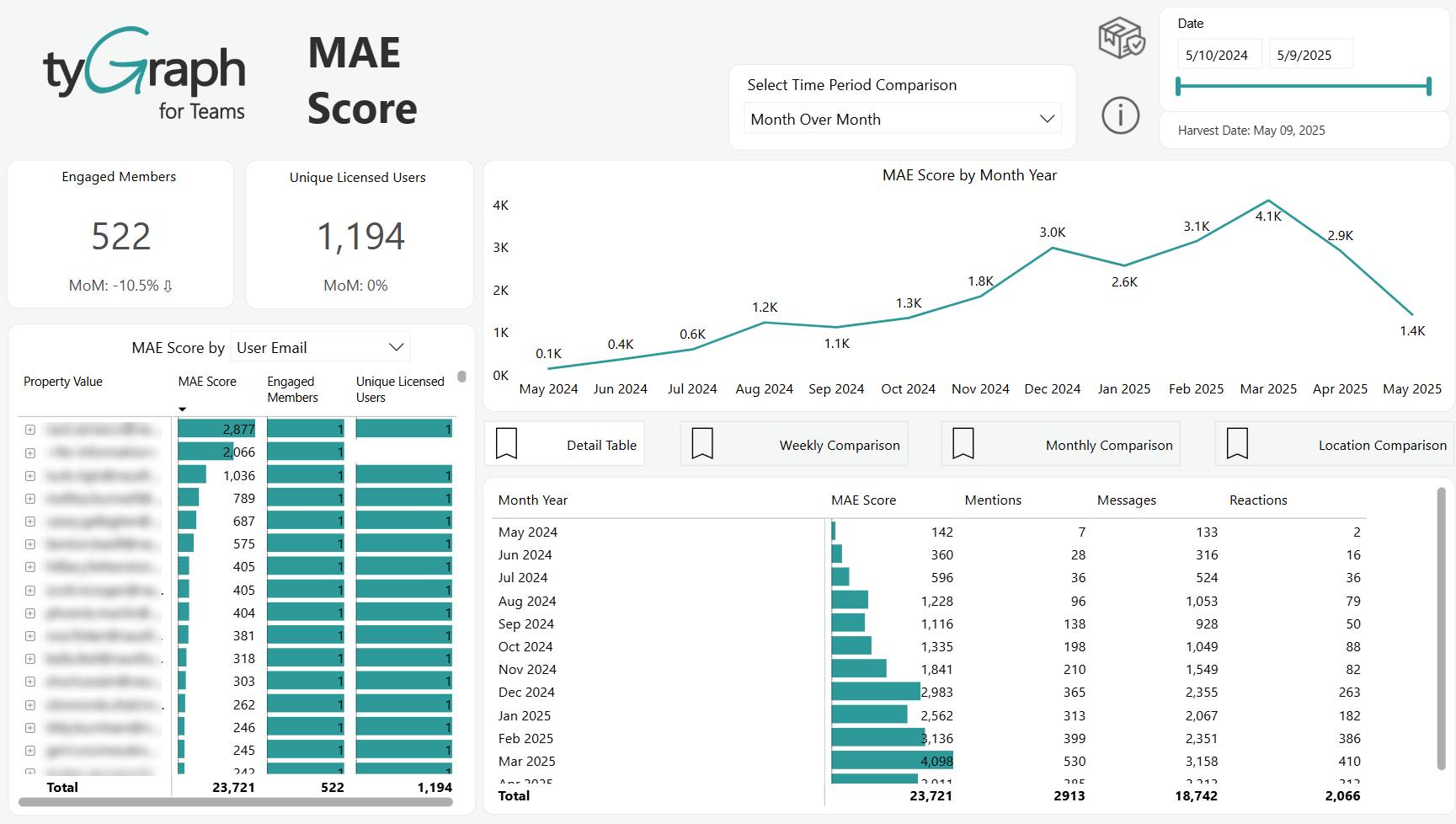
Select the Average minutes on news posts card to view detailed visuals.
-
Average Time on Page (minutes) over time – Displays how the average time spent on news posts has changed over time. Use the drill down buttons to view the change over different periods of time (year, quarter, month, week of, and date)
-
Average Time on Page by User Property – Displays the average time spent on news posts broken down by user property value. Use the property name slicer to switch between different user properties.
News Posts per 1000 Users Detail
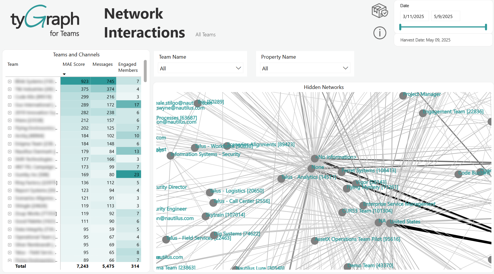
Select the News Posts per 1000 Users card to view detailed visuals.
-
News Posts per 1000 Users Over Time – Shows how the number of news posts per one thousand users has changed over time. Use the drill-down controls to analyze changes by year, quarter, month, week, or specific date.
-
Top News Pages – Lists the top-performing news pages, sorted by average time spent on the page. Each row includes the author’s email and the page creation date.
Compliance Overview
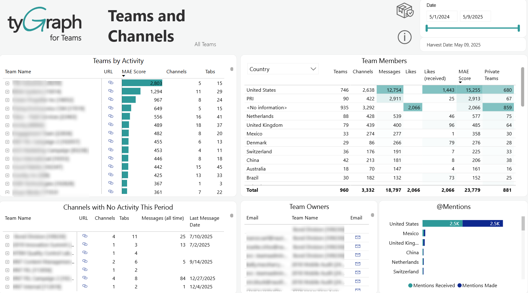
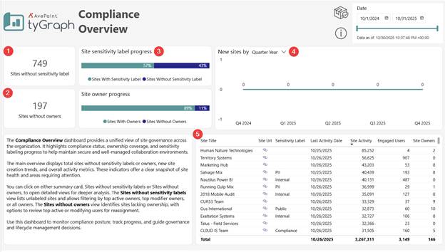
This page provides a high-level governance summary across all sites.
-
Sites without sensitivity labels – Displays the total number of sites that currently do not have a sensitivity label applied. This count serves as an indicator of where information classification has not yet been assigned. Selecting this card opens a detailed view for these sites.
-
Sites without owners – Shows the total number of sites that do not have at least one assigned site owner. Ownerless sites represent compliance risk due to unclear oversight. Selecting this card opens a detailed view for these sites.
-
Site sensitivity label progress – A bar visual showing the proportion of sites that have a sensitivity label versus sites that do not. It illustrates labeling coverage across sites in the reporting scope and helps identify overall compliance posture.
-
New sites over time – Displays the number of newly created sites filtered by the selected period grouping (e.g., Quarter Year). This allows monitoring of site creation trends in relation to compliance adoption.
-
Site inventory table – A detailed list of sites with core attributes, including Site Title, Site URL, Sensitivity Label, Last Activity Date, Site Activity level, count of Engaged Users, and count of Site Owners. Sorting can be used to identify highly active, high-risk, or incorrectly governed sites.
Compliance Overview – Sites without sensitivity labels
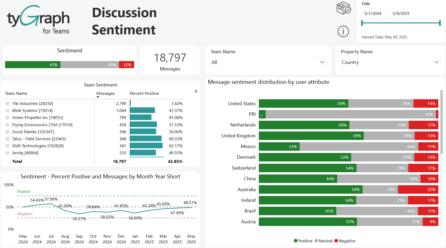
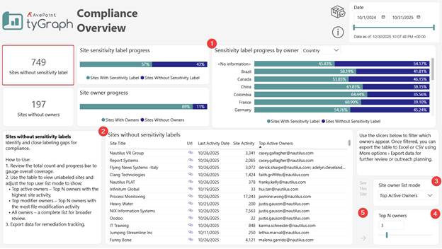
This view focuses on sites missing sensitivity labels and provides tools to identify and prioritize remediation.
-
Sensitivity label progress by owner – A bar visual showing the proportion of labeled and unlabeled sites grouped by owner property. This helps identify patterns of compliance adoption and locate areas where outreach or support may be needed.
-
Sites without sensitivity labels table – Displays all sites lacking a sensitivity label, including site title, URL, activity timestamps, site activity, and applicable owner details. This list is used to evaluate overall coverage and determine remediation opportunities.
-
Top owner list mode – Dropdown used to control how owner lists are calculated in the table. Modes include:
-
Top Active Owners
-
Top Modifier Owners
-
All Owners
-
-
Switching the mode allows prioritizing owners most likely to drive timely remediation.
-
Top N owners slider– Adjusts the number of owners displayed per site, based on the selected list mode. Ideal for narrowing focus to the most active or influential owners.
-
See This Site button – Select a site from the table and click this button to drill through to the Content Detail page.
Compliance Overview – Sites without owners
This view focuses specifically on sites lacking ownership, allowing targeted governance remediation.
-
Site activity by user property – Bar visual showing site activity volume grouped by the selected attribute (e.g., Country). Use the dropdowns to change which property is displayed and how results are grouped.
-
Ownerless sites table – List of all sites currently without owners. The table includes key operational and compliance indicators, supporting targeted follow-up.
-
Top user list mode – Dropdown used to define how “Top” users are determined in the table. Modes include:
-
Top Active Users
-
Top Modifier Users
-
All Users
Changing this setting adjusts the visible user list so remediation can focus on the most relevant individuals.
-
-
Top N users **slider –**Controls the number of users shown per site based on the selected list mode. This allows narrowing the view to the highest-priority candidates for engagement or ownership discussions.
-
See This Site button – Select a site from the table and click this button to drill through to the Content Detail page.
Content Details
-
Most active users – Displays the users with the highest levels of content engagement and modification over the last 180- and 365-day periods. The users highlighted here are those selected based on the list mode and Top N settings chosen on the Compliance Overview pages. Metrics shown include total activity counts and file modification volumes.
-
Activity over time – Shows the volume of content activity across the selected date range. This visual highlights engagement peaks, steady periods, and dips across months.
-
Content activity in the last N months – Displays the individual content objects with the highest interaction in the recent period. The time range of data available in this table is based on the ‘Detail File Period’ parameter. Measures include activity counts, number of unique users, file access, modification, and download events.
-
Top pages – Lists the highest traffic content pages by link, pageviews, and unique page viewers. This helps identify the most visible content and potential points of compliance or classification sensitivity.