Home > FAQs > AvePoint tyGraph FAQs > Analytics and Reporting > DAU/MAU Ratio
Download this articleDAU/MAU Ratio
Sometimes referred to as the "stickiness" of your web content. This tells you how often people are in your platform viewing content. The lower the ratio, the less often users are signing in.
How is the DAU/MAU ratio calculated?
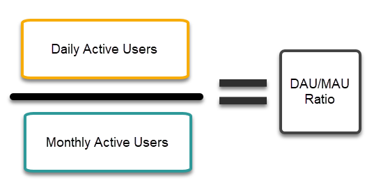
The ratio is the number of unique daily viewers divided by your unique monthly viewers. This is evaluated based on the current day in the card but for each day for line charts.

What does the ratio mean?
This ratio can be used in several ways, generally it allows you to understand how often your users are engaging with your content, but it also allows you to foresee user churn, and understand the nature of your audience.
The lower the percentage, the less often users are viewing content, so generally speaking, if your aim is to keep users returning to your content you want, this percentage to be as high as possible. You will notice the card number color will change to help you indicate where your number is on a range of good to bad.

What is a good score?
If you're looking to engage users, below 10% DAU/MAU is generally considered poor. As this would mean that users are viewing in on average 3 times a month (10% of ~30 days in a month = 3 days). Anything above 40% is very good, 60%+ is excellent.
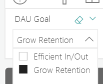
As you may have guessed already. This is predicated on the design of your site or page. For companies running a help site, you may not want your users visiting every day as that would indicate many issues. Instead, you'd like them to visit access their information and leave. To accommodate this situation, you can select your goal from the dropdown underneath this card, which will flip the coloring so that lower DAU/MAU will gain green colors.

Early indications of churn?
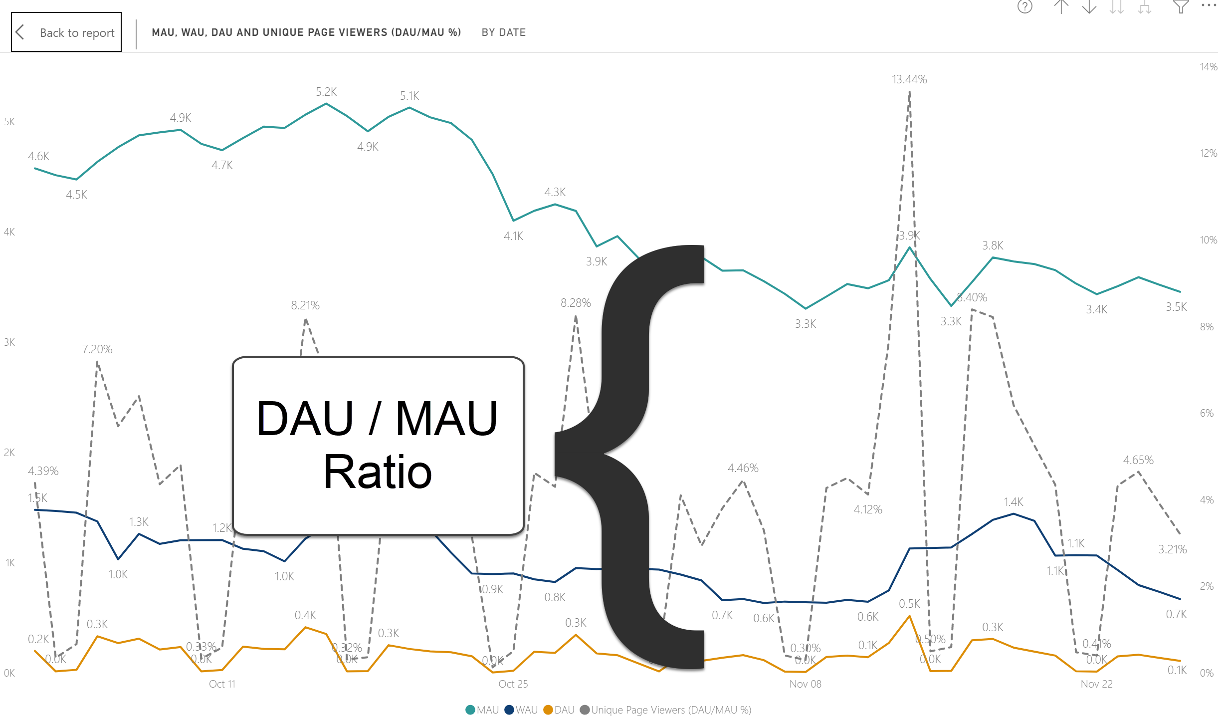
A divergence between daily/weekly active users (DAU/WAU) and monthly active users (MAU) can serve as an early indicator of churn. If your DAU/WAU trends decouple from MAU over time, it suggests that users engaging less frequently or churning entirely, even if new user acquisition temporarily masks the decline. This pattern often shows a retention issue: core users may be losing interest or disengaging, while incoming users fail to sustain long-term activity.
Detailed lists reflecting shifts in user engagement, including gained users, lost users, and first time users, can be found in the Site Audience and Page Performance reports.
Related terms
-
Daily Active Users – DAU
This is the total number of users who are viewing your hub, sites, or pages on a daily basis. This is a unique count of viewers on the day that you have selected or plotted on a chart.
-
For this reason, your daily active user number can fluctuate a great deal but you should be comfortable with the general trend of this number as you'll be used to seeing it everywhere that we reference unique page viewers.
-
Weekly Active Users – WAU
This is the total number of users who have viewed your content in the past 7 days. The time series plot will consider the preceding 7 days for each day being evaluated. Similar to daily active users, this is a unique count of viewers.
See our full article Weekly Active Users for details.
-
Monthly Active Users – MAU
This is the total number of unique users who viewed your content in the last month. On time series visuals evaluate this for each date on the plot.
See our full article Monthly Active Users for details.