Home > Power BI Report Guides > tyGraph for OneDrive
Download this articletyGraph for OneDrive
This summarizes all tooltips on the latest tyGraph for OneDrive report. All tooltip items are brief descriptions of the visual and calculation, limited to 250 characters. Bolded Help – items are for help icons backed by a tooltip page.
Universal Items – Toolbar

-
The Box icon – This box shows you the report's release date and the version of the tyGraph engine.
-
Date slicer – This shows you the report period for the page you are on at a glance. This is very important if filters are applied either from the canvas slicers or the filter UI on the right.
-
Harvest date – This shows the most recent date in the dataset. If the date is behind what you expect, check if the dataset has refreshed. If you are in tyGraph Online please contact support or your Admin immediately.
-
The Logo will redirect you to our website: AvePoint tyGraph.
OneDrive Overview
-
Engaged Drives % Change – This card shows a ratio of the number of drives with activity for the report period and the total drives that have existed for the same time period.
-
Engaged Users % Change – This card shows a ratio of the number of teams involved in a message, reaction or mention for the report period and the number of total existing teams for the same period of time.
-
Engaged drives have had usage change activity for the report period. A drive is counted once regardless of activity volume. The gauge baseline is the total existing OneDrives. For a full list of counted usage see the drill down on usage in the activity type donut chart.
-
An engaged external user is external to the tenant and has taken any act of engagement for the report period. The baseline of this measure is engaged internal users for the report period to show what proportion of engaged users were external.
-
Activity Types – Analyze your tenant (engaged users numbers/percentage) by activity type in this donut chart. You can drill down to see the full list of activities under each category, or you can view all activities at the detailed level using double-down arrows above the visual.
-
OneDrives – This table shows a full list of drives with some stats related to it (file numbers, number of file and sync activity, number of both internal and external users, storage quota used by them, etc. ). Activity is a total of all activities. Files show all files, Engaged users are distinct users who had any form of activity for the report period.
-
User Adoption – This visual shows your adoption journey in OneDrive Business by different levels of time frame which can be drilled up/down. This visual contains a dynamic date axis which can be manipulated using the up and double-down icons in the visual header. Watch users move through the five phases of OneDrive adoption (non-engaged & licensed users, file usage only, usage & sharing only, usage & sync only, and all three activities) with the counts.
-
Area Adoption – Total unique engaged users based on their adoption pattern and segmented by organizational unit. This visual contains a dynamic hierarchy that allows you to use the up and double down arrows to change the aggregation all the way down to user email.
-
The Globe icon – Clicking this globe icon will show you activities by user location. You can drill up to see activities by country, and continent level.
-
Activity by user location
-
Activity by user country
-
Activity by user continent
Non Adoption Detail
-
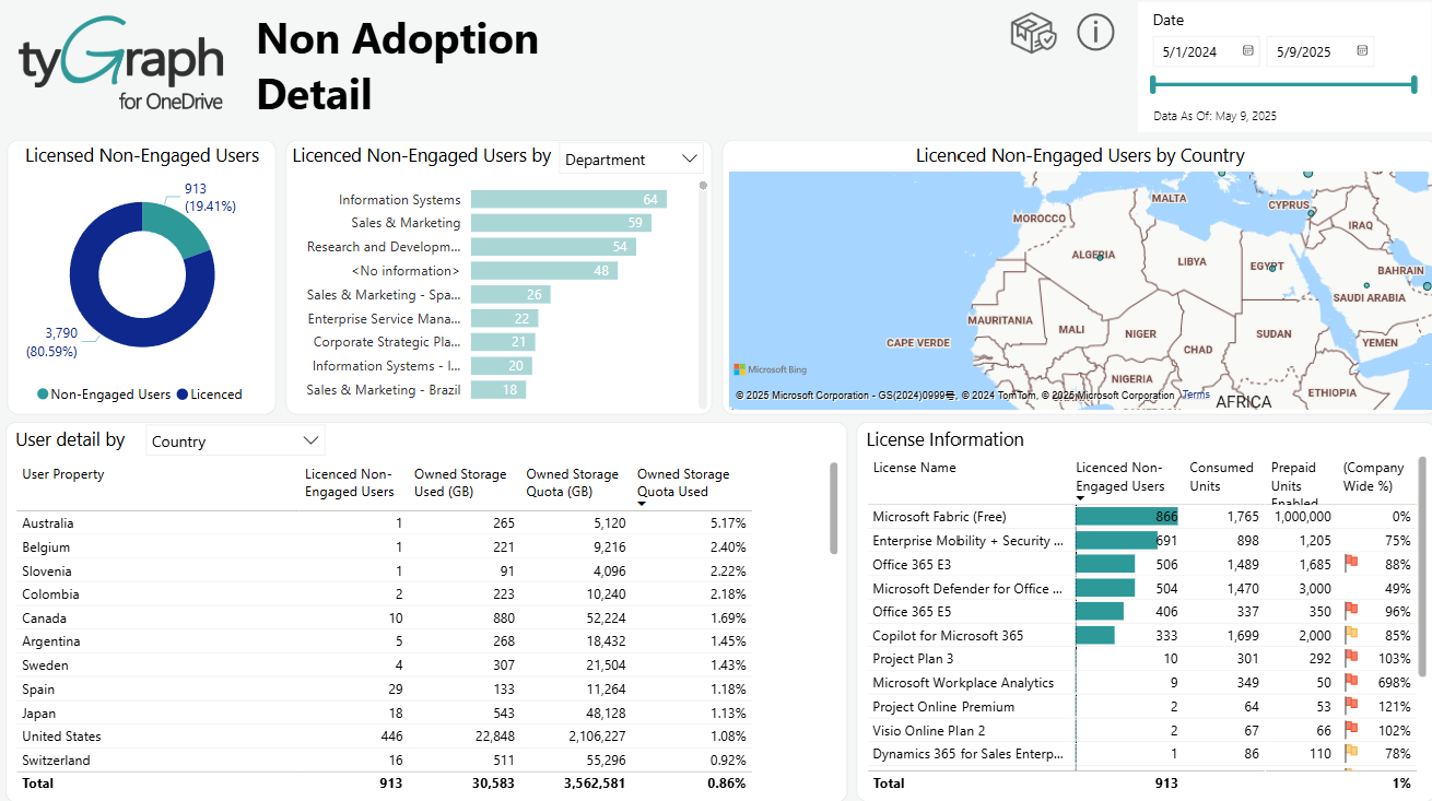
Licensed Non-Engaged Users – This donut chart shows the percentage of Unique Non-Engaged Users and Licensed members in the report period.
-
Licensed Non-Engaged Users by User Property – This bar chart shows the number of total unique licensed, non-engaged users by selected filter condition for the report period, including Country, Job Title, Organization, Department, User Email, and Region (built-in).
-
Licensed Non-Engaged Users by User Country – This map shows the total unique licensed, non-engaged users by AD profile location hierarchy for the re. This can be manipulated using the hierarchy arrows at the top of the visual allowing you to see various slices of user profile locations.
-
User detail by user property – A list of exactly which users have had no audit activity in OneDrive for Business in the report period. This can be exported to Excel by clicking the ellipsis (…) in the top right of this visual.
-
License Information – This table shows license names, the number of non-engaged users, consumed units, company-wide percentage, etc. by the licenses assigned for the report period.
OneDrive Storage
-
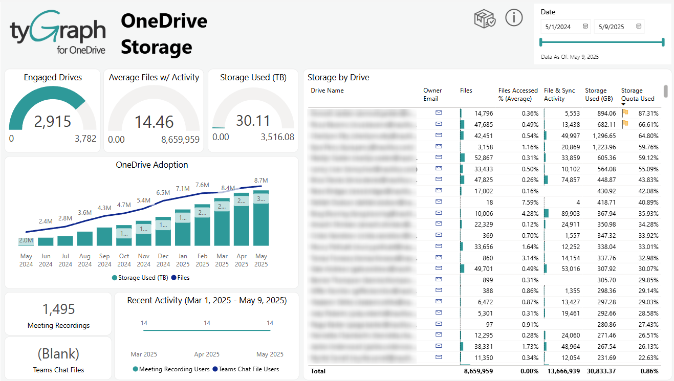
Engaged Drives – Engaged drives mean the drives which are not idle and have had usage activity for the report period. A drive is counted once regardless of activity volume. The gauge baseline is the total existing OneDrives.
-
Average Files w/ Activity – Files with activity are a count taken of any file that has had usage against it for the report period. This is taken from the Files Accessed measure. A file is counted only once regardless of activity volume. The baseline is the total existing files.
-
Storage Used – This gauge shows the total storage used across the selected drives for the report period. The gauge baseline is the total space for the selected drives. This is a great gauge to keep your eye on when between timeframes or selecting several owners on the table on the right side.
-
Storage by Drive – This table shows drive statistics by each owner. You can sort by any column by clicking the column title at the top. This table shows how many files are there in each drive, the average files accessed percentage, the number of file & sync activity, their used storage, etc.
-
OneDrive Adoption – This visual indicates the OneDrive adoption for the report period. It shows the total storage used in (GB), average number of accessed files and average number of files on the drives. This visual has a month and date hierarchy. This means you can select the double-down arrows at the top of the visual to change the axis between date and month.
-
Meeting Recordings – This card shows the total number of meeting recordings for the report period.
-
Teams Chat Files – This card shows the total number of Teams chat files for the report period.
-
Recent Activity – This line chart shows how many users were involved in meetings recording and teams activity by date hierarchy for the report period. We can scroll up/down to see the stats for different levels of time.
Content Variety
-
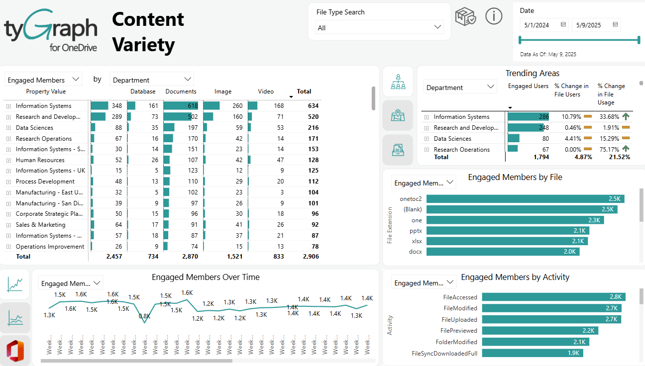
Engaged Members by Content – This table is a total of all drive activity by content type for engaged members and drives for the report period. You can explore the data from different perspectives by selecting specific user attribute, including Country, Job Title, Organization, Department, User Email, and Region (built-in).
-
Trending Areas – This table shows the changing trends of file users and usage for three categories: different Owner job titles, different owner cities, and different file extensions. We can drill up/down to view the stats from different hierarchies.
-
Engaged Members by File – This graph shows the number of activities, engaged drives, and engaged members for different file extensions. You can drill up to see the stats at different levels.
-
Engaged Members over Time – In this line chart, you can see the trends of activities, engagement of drives and members over time. You can drill up and down to see the trends for different levels of time.
-
Engaged Members by Activity – This graph shows the number of different file activities for engaged drives and engaged members. You can drill up to see the stats at different levels.
Sync Activity
-
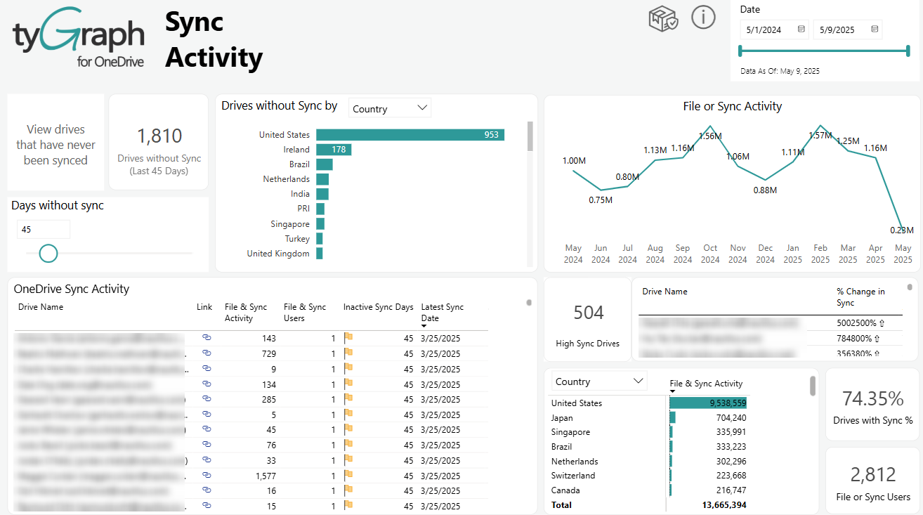
Drives without Sync card – This card shows you the number of drives without sync for a certain period of time.
-
Days without Sync filter – Use this to filter to drives that have not had sync or file usage in a certain period of time in the table below.
-
Drives without Sync by User property – The total unique number of drives that have not had sync or file usage in specified days. You can explore the data from different perspectives by selecting specific user attributes, including country, job title, organization, department, user email, or region (built-in).
-
File or Sync Activity – Total of all sync activities by files. This contains a month and day axis which can be manipulated using the drill-down icons in the visual header. This considers both file usage events and sync activities as sync.
-
OneDrive Sync Activity – This chart shows sites by the latest sync or file usage date and volume. This is best used to sort by using combinations of the latest sync date and the total drive users to decide which Drives are being used.
-
High Sync Drives – This shows the number of highly synced drives for the last two weeks.
-
Sync Activities Change for Drives – This table shows the percentage of sync activities change for the drives is shown in this table. We are showing the percentage of drives on the left that have sync or file usage compared with the total number of drives owned by that organizational unit.
-
File & Sync Activity by Users – File Sync and Sync Activity by users against files in the given drive(s) for the report period. This allows you to see the number of users also accessing documents in the same drive other than the owner. This visual can be drilled up/down to see the stats from different hierarchies.
-
Percentage of Synced Drives – This card shows the percentage of synced drives among all the drives for the report.
-
File Usage or Sync Users – This card shows the total number of file usage or sync users.
-
View drives that have never been synced – If we click this card, we can see the details and stats of the drives that have never been synced.
Shared Content
-
Drives Sharing Content – This card shows us the number of drives with sharing contents for the report period.
-
Secure Invitations – This card shows all secured invitations created for that report period. This is when a user shares a resource in SharePoint online or OneDrive for business with a specific user inside or outside your organization's directory.
-
Anonymous Invitations – This card shows the number of anonymous invitations for the report period. This is when a user shares a resource in SharePoint online or OneDrive for business via an anonymous link (also called an Anyone link).
-
Eternal Users – This card shows the total number of users accessing resources outside your organization's directory for the report period.
-
Sharing Invitations and Non-owner Activity by Month – This chart shows the sharing invitations and non-owner activity over time. This includes a drill-down option to switch from the default Month Year axis to Date.
-
Sharing Activity by Drive Owner – This table shows total sharing activities by drive owners’ user attributes for the report period, including country, job title, organization, department, user email, or region (built-in)..
-
Drive Consumers – This table shows total sharing invitations and file usage by user property for the report period, including country, job title, organization, department, user email, or region (built-in). This takes the perspective of the user making the action. This means activity taken by a user in that area regardless of the drive they shared or accessed shared content from.
-
Sharing Activity by Type – This bar chart shows a simple total of all sharing activities by activity type for the report period. You can drill up/down to see the sharing activity counts for different file type hierarchies. This allows you to select a region, drive, user, or file in the neighboring visuals and see exactly what activities were occurring for your context.
-
Users and File Access by Country – This map shows file usage activity by user AD profile location for the report period. Often, users will generate access events against documents that have been shared with them and you will see this plotted by user location here.
-
Proactive Sharing – This bar chart shows the count of sharing activity by drive names for the report period.
*Note: Who and how are my users sharing content? – This compares users where they generated a sharing link. This includes all four link types:
-
AnonymousLinkCreated – Link anyone with the link
-
Company Link Created – People in xyz with the link
-
SecureLinkCreated – People with Existing Access
-
Added to Secure Link – Added to Secure link + People with existing access
-