Home > Power BI Report Guides > tyGraph Calling
Download this articletyGraph Calling
tyGraph Calling provides analytics on Microsoft Teams calling, meetings, and license usage. This report looks at your data from a Microsoft Teams communications perspective. tyGraph Calling will provide your company with deep insights into how your employees use Microsoft Teams to communicate through calls, how much time is spent in meetings, and how much money calls and meetings cost your organization. The report also dives into Microsoft license usage and wastage. Explore the main areas of the report to gain a deeper understanding of your organization’s communication behaviors:
-
Company Behavior – Presents a high-level overview of your organization’s communications patterns within Microsoft Teams. You can view high-level metrics for Total Call Volume. Unique Participants, Time Spend Analysis, Unadopted Licenses, and Ineffective Calls. Each high-level area can be divided into more granular levels offering a detailed report page for each.
-
License Adoption & Enablement – This report page displays an inventory of Microsoft licenses from a Teams Calls perspective. As well as view summarized data on either Meeting Rooms or PSTN call volume. Meeting rooms utilized, meeting organizers, and their participants.
-
Call Performance – Here, you can find a detailed analysis of Call Performance. Showcasing your organization's busiest times. This page also allows a user to select a participant and analyze the performance of their calls. This helps identify the quality of calls in a call center environment for example.
Universal Report Header
-
Our Logo will redirect you to our website – AvePoint tyGraph.
-
User Attributes Slicer – This slicer is loaded with data from the "User' table which is populated with the Microsoft Entra ID tenant’s user information such as city, job title, country, and division to name a few. Which can then be applied to all metrics and visuals for advanced filtering options.
-
Time Intelligence Comparison – This slicer contains the time period comparisons that get projected into the fields located directly below each KPI card. Want to see the month over month trend of your Total Call Volume? Simply select it in the drop down and you will see the percentage change along with the corresponding trend icon up or down for each metric.
-
The Box icon – Hover over this to see the version of the report and database information. Click here to go to the tyGraph Dev Blog, where you can learn about changes or additions to the report.
-
Date Slider – This is a rolling filter that is enabled by default. Use this to select a rolling range of recent dates. You can erase this slicer to select specific dates (below) outside the rolling range. You can glance at the Report Period element at any time to see the overall filter.
-
Harvest Date – This is the most recent datapoint collected by tyGraph. If the date is behind what you expect, check if the dataset has refreshed. If you are in tyGraph Online, please contact support or your Admin immediately.
-
Filters – Set a variety of filters to narrow the scope of the data and view your data from your personalized perspective.
Company Behavior
The Company Behavior Page is comprised of five different reports controlled by buttons one through five vertically on the left side of the page. The differing sections provide insights into:
-
Call Volume
-
Unique Participants
-
Time Spend (Hours)
-
Ineffective Calls
-
Unadopted Licenses
Most visuals on the page can be filtered using the user attribute slicer in the header and time period comparisons can be drawn for major KPIs using the Comparison slicer. The Comparison slicer will project its metric in percentage form directly below each KPI with a trend arrow either up or down.
Call Volume
This KPI card also doubles as a button and once clicked, your page will focus on the below metrics and visuals. The KPI Call Volume is a high-level total of all calls across your organization inclusive of all types.
-
Group Calls – The KPI card displays total calls where there was more than one person.
-
PSTN Calls – KPI card displaying the total number of PSTN calls, which are defined as a Microsoft offered service to support PSTN calls captured for all Microsoft Calling Plan phone calls coming in and out of your routing service. This includes external users phoning into meetings organized by your company. This also includes users within your company phoning into calls organized by other companies.
-
Direct Calls – KPI card displaying the total direct calls. A call between one other person. Sometimes people refer to these as Peer to Peer calls.
-
Group Calls – Horizontal bar graph that displays the corresponding KPI which in this case is Group Calls, but can be configured to compare by a user-selected attribute in the slicer in the header.
-
PSTN Calls – Horizontal bar graph that displays the corresponding KPI which in this case is PSTN Calls, but can be configured to compare by a user-selected attribute in the slicer in the header.
-
Direct Calls – Horizontal bar graph that displays the corresponding KPI which in this case is Direct Calls, but can be configured to compare by a user-selected attribute in the slicer in the header.
-
Measure by type of call – This slicer is loaded with the corresponding metrics being displayed on the currently selected report page. So you will have the option of displaying Call volume, Group Calls, PSTN Calls, or Direct Calls in the line graph to see how these metrics have changed over time.
-
Date Slicer – This offers easier to access date configurations for the line graph it is embedded in.
-
Compare by – Use this slicer to aggregate the chosen metrics by the user attributes populated in your Microsoft Entra ID tenant to compare. For example, a user can select Group Calls, then Quarterly in the date slicer, and finally Department in the User Attributes slicer which will generate a user configured line graph displaying group calls quarterly compared by different departments in your organization.
-
Line Graph – The canvas that will display your configured line graph using the interactive graph title slicers.
Unique Participants
This is a KPI card displaying the total number of unique participants. Defined as participants that are each different from the other. This card also doubles as a button and once selected will change the page to display metrics around unique caller types such as Internal Participants, External Participants, and the Averages of those metrics.
-
Internal Participants – KPI card displaying the number of unique internal participants, which is defined as participants from within your tenant.
-
Avg. Participants per Call – This is the average internal participants per call.
-
External Participants – KPI card displaying the total external participants which are defined as participants who are not from your tenant.
-
Avg. External Participants – The average number of external participants.
-
Internal Participants – Horizontal bar graph that displays the corresponding KPI which in this case is Internal participants, and can be configured to compare by a user-selected attribute in the slicer in the header.
-
Avg. Participants – Horizontal bar graph that displays the corresponding KPI which in this case is Average participants per call, and can be configured to compare by a user-selected attribute in the slicer in the header.
-
Avg. Participants per Call Stacked – A horizontal 100% stacked bar graph showing the percentage between internal versus external participants, in a percentage, compared by departments.
-
Date Slicer – This offers date configurations for the line graph it is embedded in.
-
Compare by – Use this slicer to aggregate Total Participants by the user attributes populated in your Microsoft Entra ID tenant to compare. For example, a user can select Quarterly in the date slicer, and finally, department in the User Attributes slicer which will generate a user configured line graph displaying Total Participants quarterly compared by different departments in your organization.
-
Line Graph – The canvas displaying your configured line graph using the interactive graph title.
Time Spend (Hours)
Following previous design patterns this KPI card again also doubles as a button and when clicked on presents a report page with the below metrics and visuals. Time Spend is defined as the total cumulative time spent by users on calls. If three people are in a concurrent call each of their time is added up.
-
Most Expensive Calls – This grid will show you your most expensive calls per month. This is based on calls with the longest call time and the most participants multiplied by the average wage input into the wage slider on the Call Performance page.
-
Avg. Call Duration Minutes – KPI card displaying the average durations of all calls in minutes.
-
Avg. Daily Calls per Person – KPI card displaying the average number of calls per day per person.
-
Avg. Call Minutes Horizontal – This bar graph will tell you the average call minutes but can be configured to compare by the selected user attribute located in the header.
-
Avg. Daily Calls – This will tell you the average number of daily calls but can be configured to compare by the selected user attribute located in the header.
-
Date Slicer – This offers easier to access date configurations for the line graph it's embedded in.
-
Compare by – Use this slicer to aggregate Time Spend Hours by the user attributes populated in your Microsoft Entra ID tenant to compare, which are rendered in the graph area it is embedded in. For example, a user can select Quarterly in the date slicer, and finally department in the User Attributes slicer which will generate a user configured line graph displaying Time Spend Hours quarterly drawing a comparison between different departments in your organization.
-
Line Graph – The canvas displaying your configured line graph using the interactive graph title.
Ineffective Calls
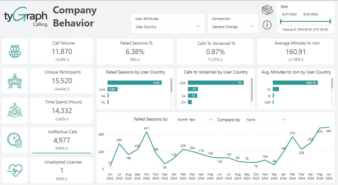
This KPI represents the total number of calls deemed ineffective, defined as calls that failed at either the setup or mid call stage.
-
Failed Sessions % – KPI card displaying the percentage of failed sessions which is total failed sessions divided by total sessions.
-
Calls to Voicemail % – This is the percentage of calls that do not get answered and go to voicemail. Calculated by dividing total calls to voicemail by total calls.
-
Avg. Minutes to Join – KPI card showing you the average amount of time it takes to join a call.
-
Failed Session – This bar graph displays a count of failed sessions visualized in bar graph form which can be compared by the user attributes slicer in the header.
-
Calls to Voicemail – This bar graph shows you a count of how many calls went to voicemail, and can display comparison aggregations via the user attributes slicer.
-
Avg. Minutes to Join – Another horizontal bar graph that reflects the above KPI in bar graph form but can be configured to show comparisons by selecting the desired user attribute using the slicer in the header.
-
Failed Sessions by – This offers easier to access date configurations for the line graph it is embedded in.
-
Compare by – Use this slicer to aggregate Total Failed Sessions by the user attributes populated in your Microsoft Entra ID tenant to compare. For example, a user can select Quarterly in the date slicer, and finally department in the User Attributes slicer which will generate a user configured line graph displaying Total Failed Sessions quarterly compared by different departments in your organization.
-
Line Graph – The canvas that will render your configured line graph using the interactive graph title by selecting your desired time period and user attribute slicers.
Unadopted Licenses
This is the total number of licenses that have been purchased but not used.
-
Current Licenses – KPI card displaying the total number of licenses regardless of usage.
-
Active Licenses – This is the total number of licenses with users that have activity.
-
Unused Licenses – This is the total number of licenses with users that have no activity or that have not been assigned to a user.
-
Unused License % – Total Consumed Licenses with no activity divided by Current Consumed Licenses.
-
License Name Window – This window will display all the licenses your organization owns, as inventoried in your tenant, regardless of assignment. A user can select either one or multiple licenses (by holding down ctrl), which will filter all metrics on the page by the selected license(s).
-
License Name by Counts – This grid displays the same list of licenses but also includes usage metrics and reacts to your selection in the adjacent license window.
-
Date Slicer – This offers easier to access date configurations for the line graph it is embedded in.
-
Compare by – Use this slicer to aggregate Total Consumed Licenses by the user attributes populated in your Microsoft Entra ID tenant to compare by. For example, a user can select Quarterly in the date slicer, and finally department in the User Attributes slicer which will generate a user configured line graph displaying Consumed Licenses quarterly compared by different departments in your organization.
-
Stacked Bar Graph – This area will render a stacked bar graph showing Consumed Licenses vs Unused Licenses per stack and configured using the interactive graph title.
License Adoption & Enablement
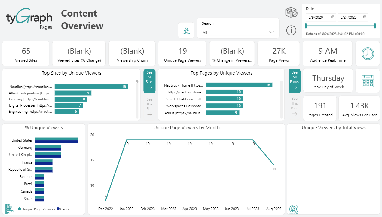
The License Adoption & Enablement Page will show you a detailed report on license consumption, call volume by type over time, and meeting room metrics showing participants and organizers counts.
-
License Name & Status Matrix – This matrix will populate with the current licenses your organization has, both free and purchased, along with the metrics showing license status, a count of each respective license, and how many of those licenses are used with a corresponding count of calls utilized per license type. There is also a drop-down selector which allows the user to target specific licenses by holding down (CTRL) and selecting multiple licenses.
-
License Name & Status Slicer – This slicer is a drop down selector that allows the user to configure all metrics on the page by whichever licenses are selected in the list.
-
Date Slicer – Allows the user to configure the stacked bar graph it is embedded into by whichever time period you would like to see.
-
Call Volume Stacked Bar Graph – Each stacked bar breaks down total call volume by these types of calls – Group Calls, PSTN Calls, and Direct Calls.
-
Meeting Rooms Button – Click this button to toggle the bottom half of the report page, displaying metrics for Meeting Room Organizers and Meeting Room Participants.
-
Meeting Rooms Organizer User Type – The organizer user type grid breaks down call organizer and non-organizer participant types then by call types and total call volume.
-
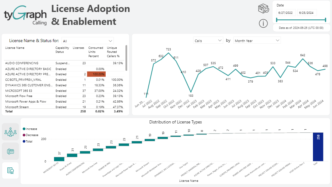
Distribution of License Types – The button that when clicked displays a visualization depicting a proportional breakdown of license types using a waterfall graph.
-
Meeting Room Organizers Grid – Presents a list of users by total call volume with different types of calls and total duration of calls in minutes. Quickly see who in your organization is spending the most amount of time on calls and making the most calls.
-
PTSN Calls Button – Clicking this button will change the bottom metrics to show similar numbers but filtering for only PTSN.
-
Distribution of License Types Graph – A waterfall graph that visualizes the proportional breakdown of license types your organization possesses, both purchased and free. The total of all licenses is displayed in the bar to the far right labeled Total.
Distribution of License Types:
Call Performance
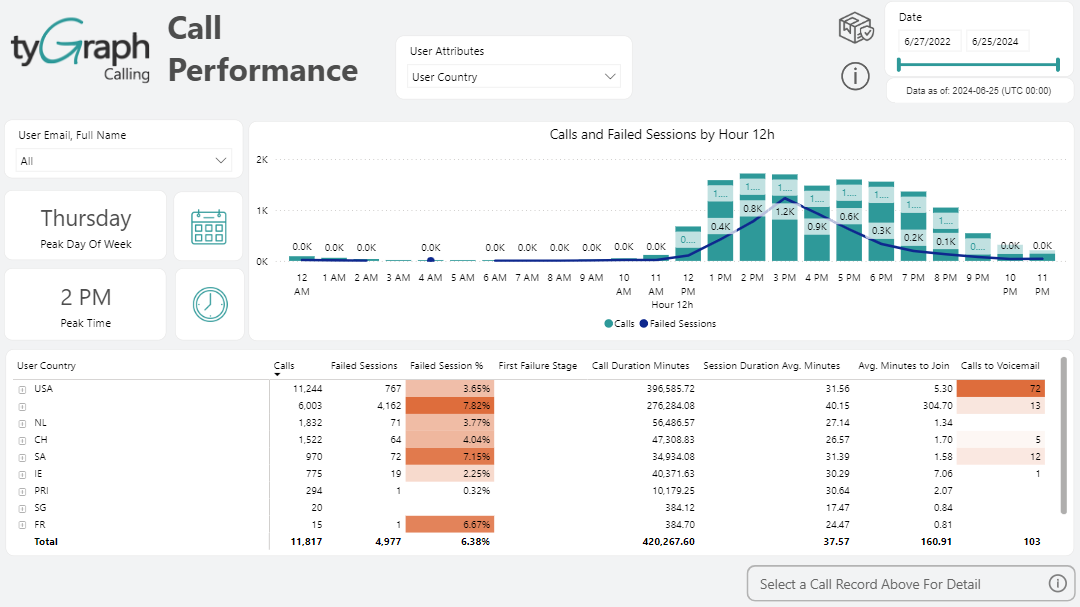
The Call Performance Page showcases call trends and volume by visualizing the peak day of the week and peak times of the day for the user selected in the drop-down selector. In the bottom portion of the report page, a user can analyze call performance by whichever user attribute is selected in the header. Expand the hierarchy by clicking the plus sign down to individual calls by each user. Select a particular call, which will then light up the button Select Call Record which once clicked will present you with a report on the details of that call.
-
User Email, Full Name Drop Down Selector – Drop down slicer populated with user e-mails which are used to filter the bar graph adjacent to it.
-
Peak Day of the Week Button – Click this button to change the adjacent bar graph to analyze call volume for the selected user from the above drop down selector. The bar graph will give you a great analysis of the peak days of a seven-day week. Bars represent the total call volume and the line represents the average time to join.
-
Peak Time Button – Clicking this button will transform the adjacent bar graph to display the peak hours of a 24-hour day. This is a great tool to determine the busiest time of day for your employees.
-
Trend Line and Bar Graph – This bar graph is manipulated by the three elements to the left of it – User Email selector, Peak Day of the Week button, and Peak Time button.
-
User Department Metrics – View call metrics aggregated by department or expand the hierarchy to view users within each department. You can then further expand the hierarchy on a user to see all of their historical metrics on a per call basis. Once viewing historical calls for a user, you can select a specific call which will then light up the Select Call Record Above button.
-
Select a Call Record Above For Detail Button – Once you have expanded the hierarchy in the list, select a historical call for a user, which will light up this button and then become available for you to click on which will take you to a detailed analysis page Call Timeline.